An onboarding redesign the business pivoted around.
I redesigned the sign-up flow and dashboard for Lessy's primary user: real-estate agents on desktop. Sign-up conversion lifted 5%, and the dashboard work shaped the product's next direction.
Brief
Lift sign-up conversion on Lessy's web app and design a property-report dashboard that gave real-estate agents a single place to compare properties, generate price predictions, and review applicant matches. Desktop first, since that was where the work actually happened.
Problem
70% of Lessy's users were real-estate agents, and their admin lived on desktop, in long sessions across multiple tabs. The product had been built on mobile-first patterns the agents weren't using that way: a sign-up flow that asked for too much at once, and a home surface that didn't lead with the data agents kept opening other tabs to find.
My role
As Senior Product Designer on Lessy, I led the redesign end-to-end:
- Mapped the existing sign-up flow against drop-off and account-manager feedback
- Sketched and tested two flow directions before settling on a three-step model
- Defined the dashboard's information architecture and four-surface layout
- Composed every screen from the Lessy design system, no new primitives
- Ran usability sessions with agents and iterated against their feedback
- Worked alongside engineering through build, QA and ship
Approach
Three principles guided the redesign:
- Desktop focus. Designed for the admin workflow agents actually had, not a hand-me-down mobile pattern.
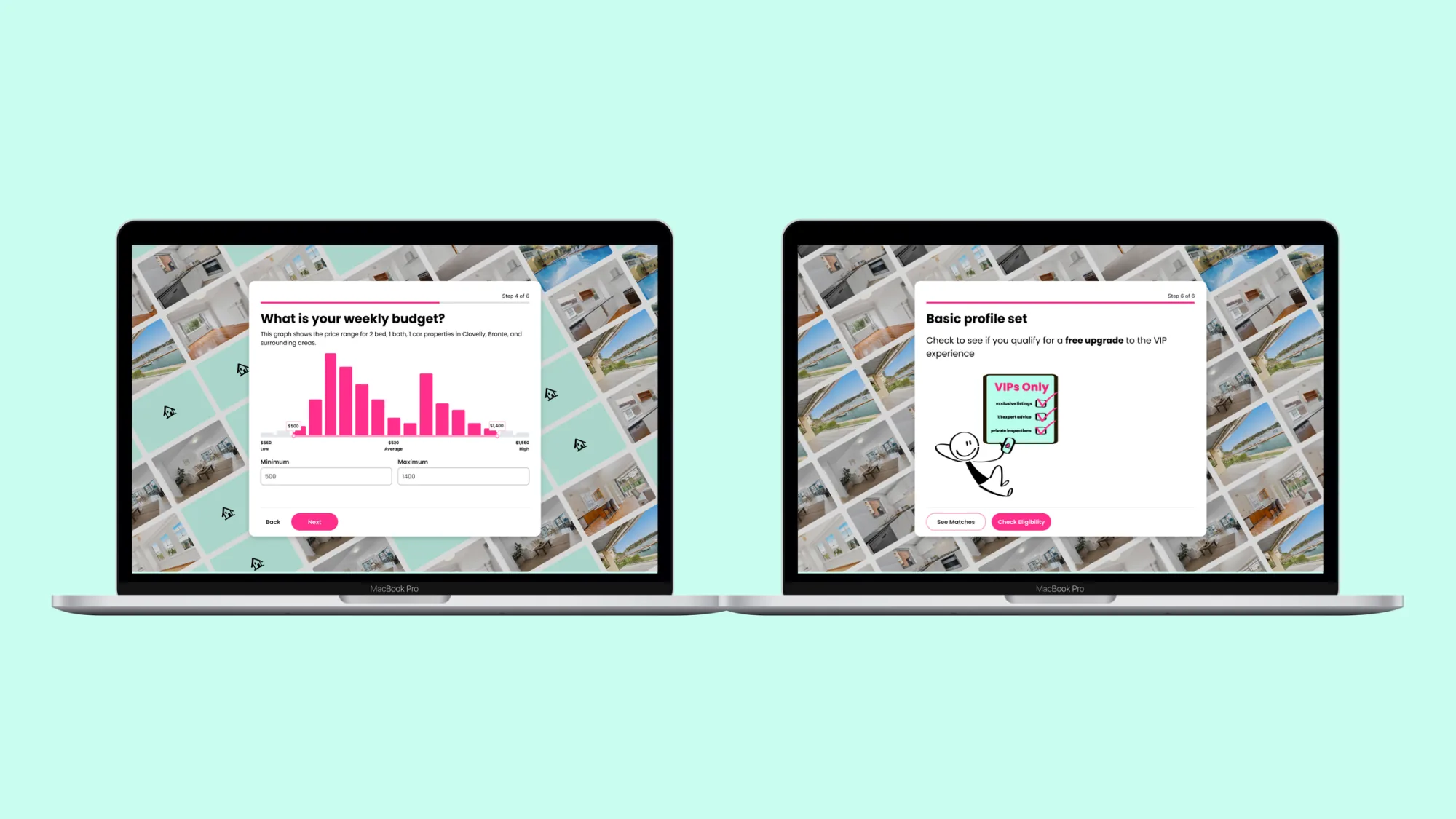
- Progressive disclosure. Only what's needed, when it's needed. Cognitive load drops, completion goes up.
- Gamification. An interactive background that gradually unveils a property image as the user advances. A small motivator that makes a transactional flow feel earned.
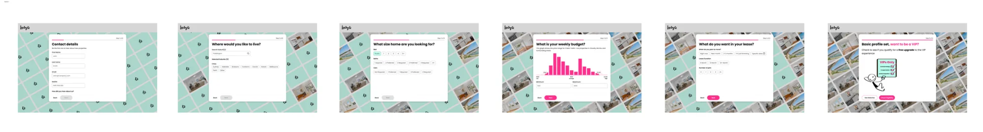
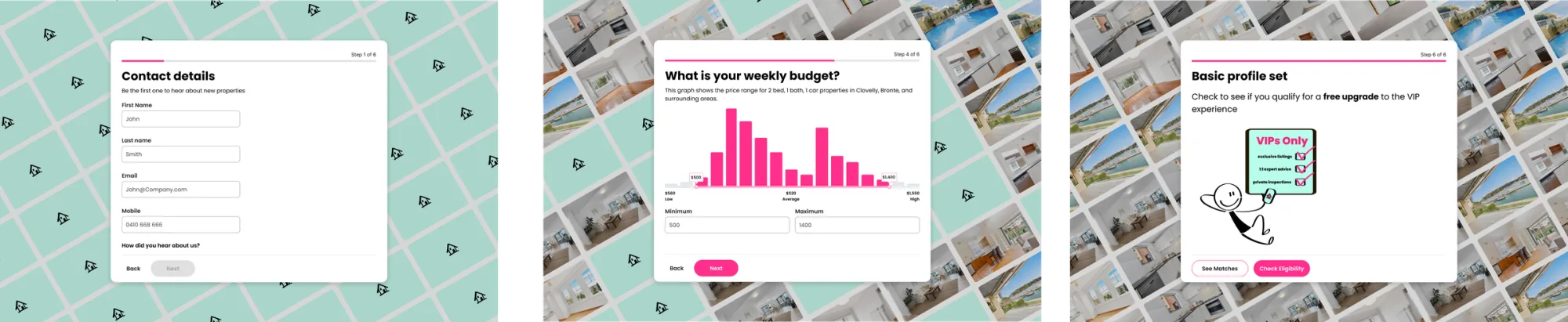
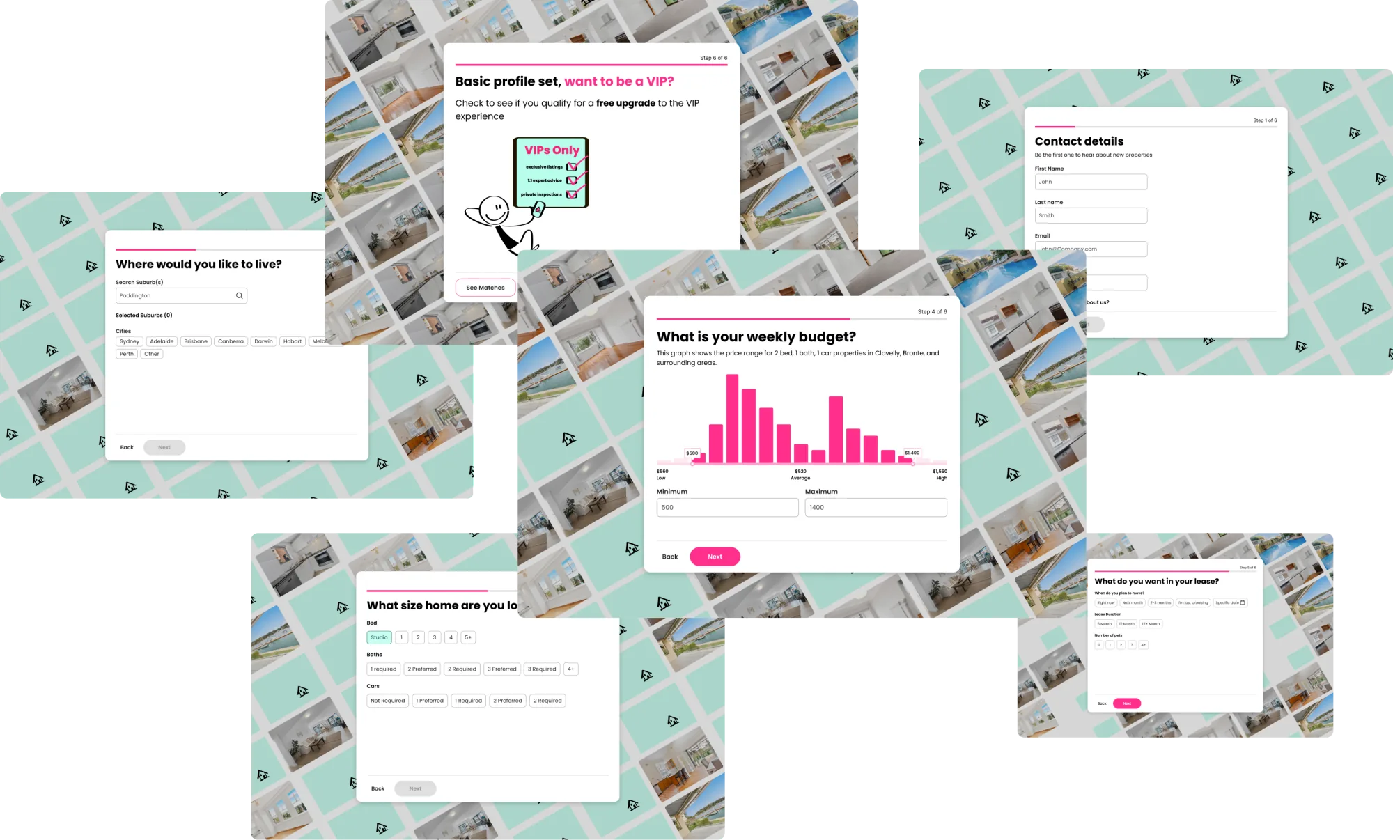
Flow exploration
I sketched two directions for the sign-up flow before testing them against agents. The first packed identity, role and property association into a single dense screen with the form on the left and the property image on the right. It read fast, but it asked agents to commit to too many decisions at once and the property image had no relationship to progress.
The second direction broke the same fields into three steps and tied the property image to step completion: each step revealed another stripe of the photograph behind. Same fields, lighter cognitive load, and a small visual reward for moving forward. Agents completed the second direction faster in testing, and that's the one that shipped.
Final designs
Two acts. The sign-up flow first, then the dashboard that shaped the product's next chapter.
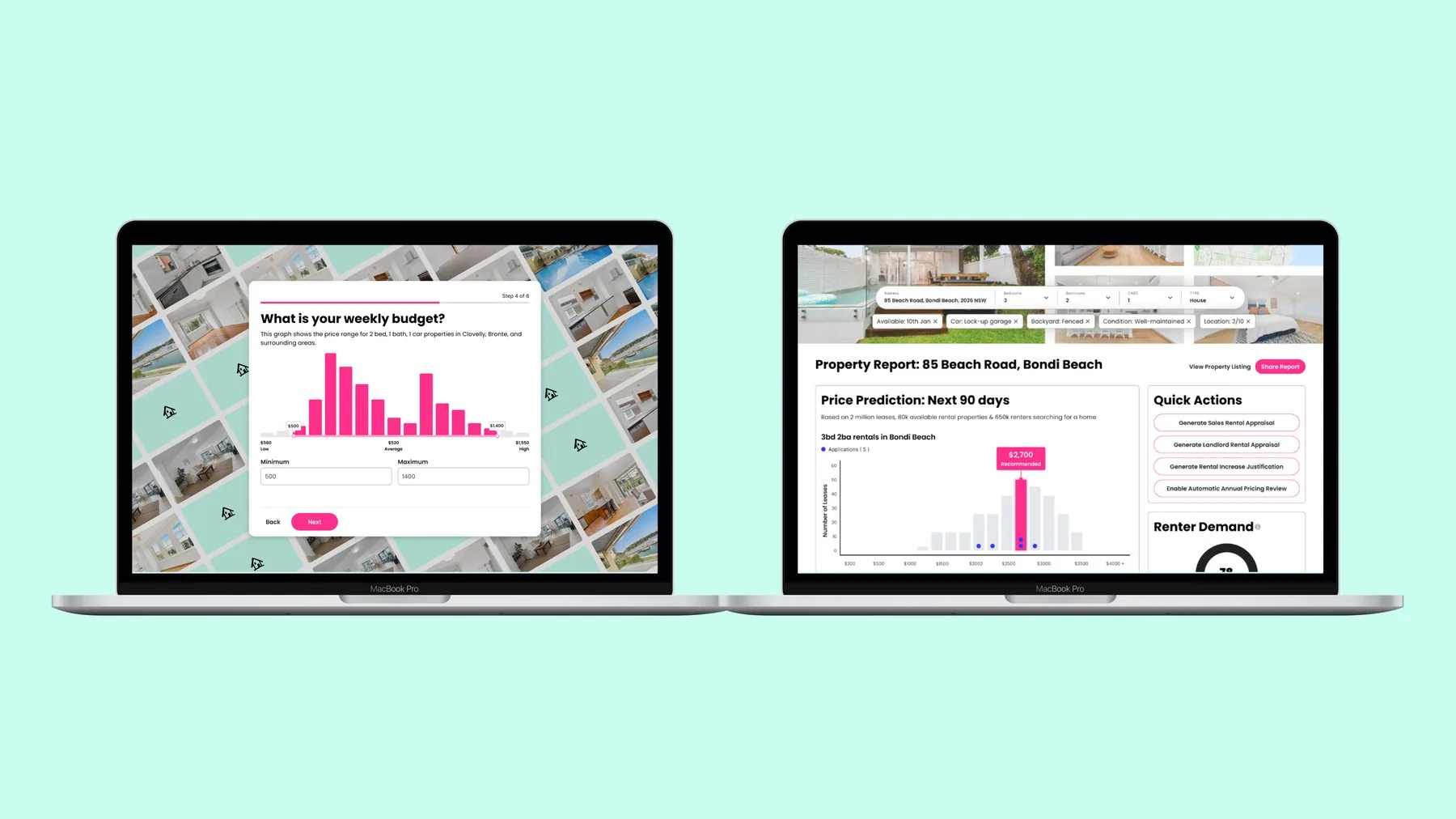
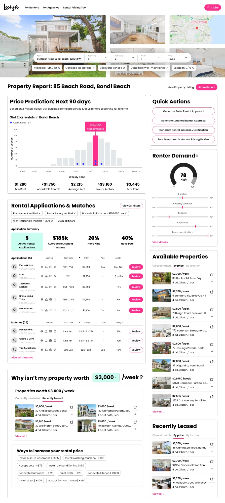
Property report dashboard
A dynamic, data-driven property report for renters and agents. The brief: compare properties, generate price predictions, and surface application matches, all pulling from Lessy's community data and external APIs.
Four primary surfaces: price prediction (90-day forecast on comparable properties), application summary (active applications with applicant detail), renter matches (surfaces from the Lessy community), and quick actions (landlord reports, rental appraisals, evaluations).
Built on the design system
Every screen here uses the Lessy design system: same tokens, same components, same behaviour patterns as the rest of the platform. The dashboard didn't add new primitives. It composed them.