UX for the RØDECaster Pro.
A UX redesign for RØDE's flagship podcasting console. I lifted usability across the user's journey while staying inside the existing visual language. Additive, not destructive.
Brief
Apply UX methodology to the RØDECaster Pro and improve usability across all stages of the user's journey. The solution must integrate into the current UI without disturbing its visual language. Additive, not destructive.
Problem
The Caster shipped without a way to save a session. Multi-host studios rebuilt their setup before every show; live performers ran the same setup ritual at every venue. The brief asked for usability, but the underlying need was state — a way for the console to remember.
Understanding the Caster
Eight channels, one touchscreen, a fixed button surface. Four XLR inputs with phantom power, USB, phone, Bluetooth, sound pads, microSD recording, 1/4" TRS headphone outputs. Every interaction had to land inside that envelope without breaking the visual system.
Landscape review
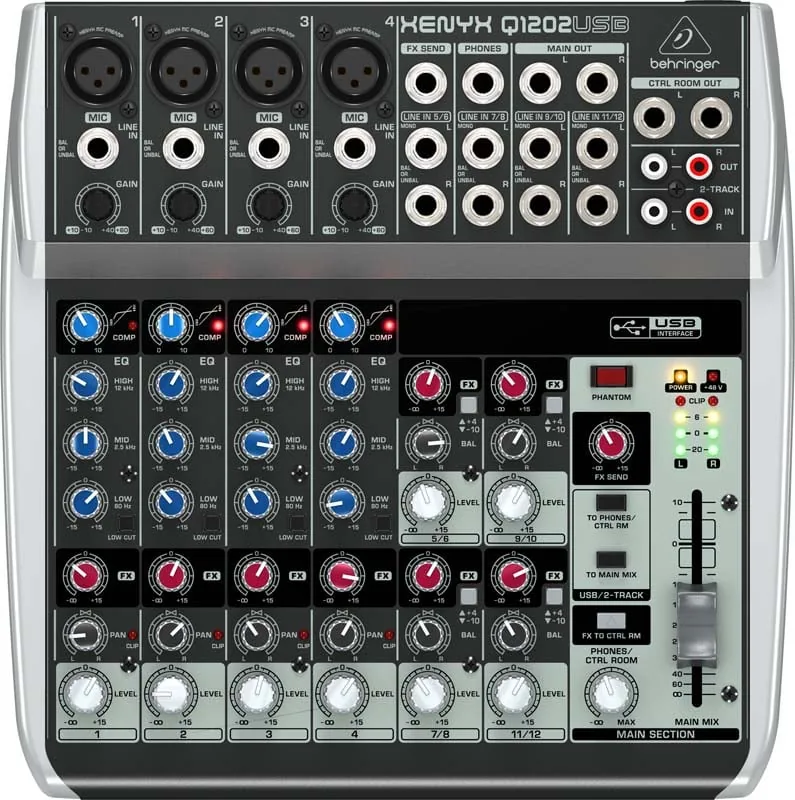
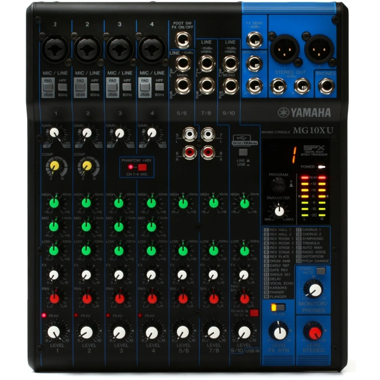
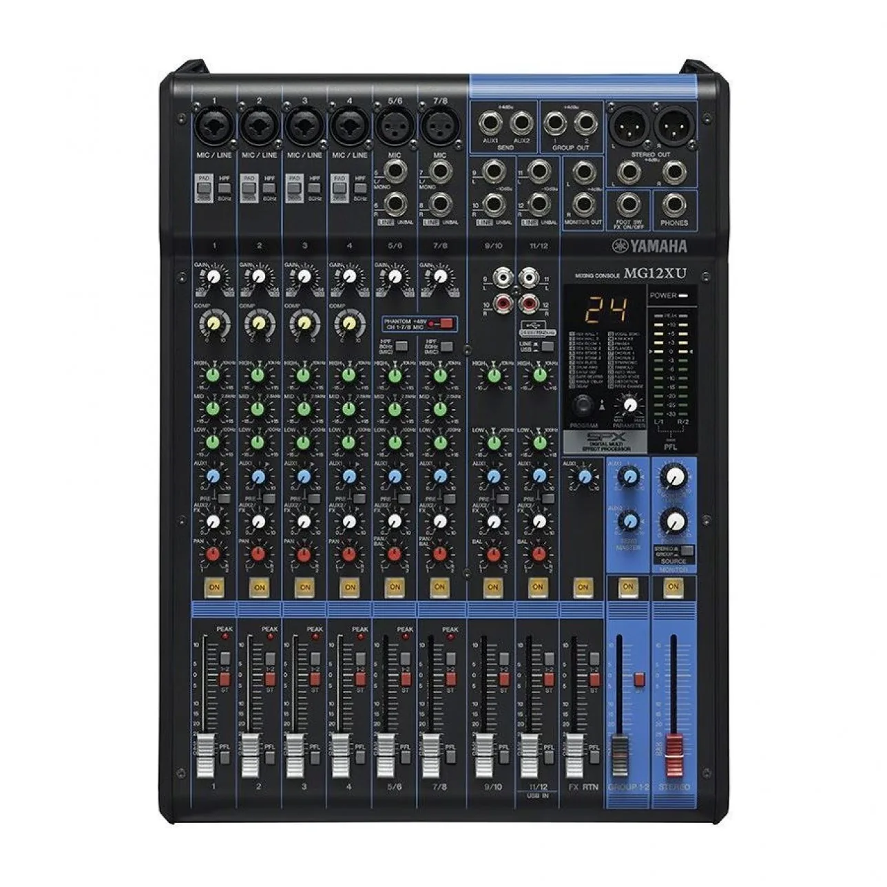
I ran a landscape sweep across three competitors representative of the category: Behringer Xenyx Q1202USB, Yamaha MG10Xu, and Yamaha MG12XU. The Caster trades knobs for a touchscreen — the review tested where that bet was paying off, and where the UX language could lean further into it.
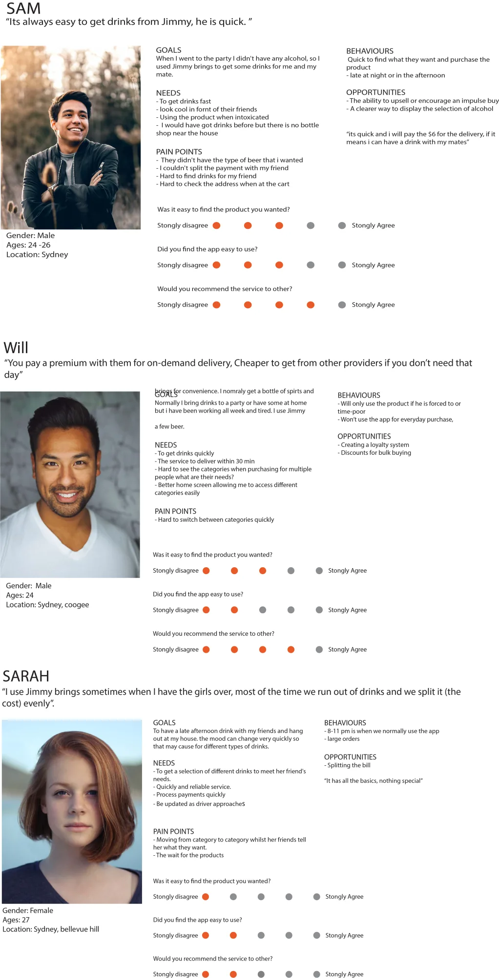
Personas & user journey
I mapped six personas across the user spectrum, from solo podcasters to multi-host studios. The journeys surfaced where the same task changed shape across user types, and where one fix could serve several at once.
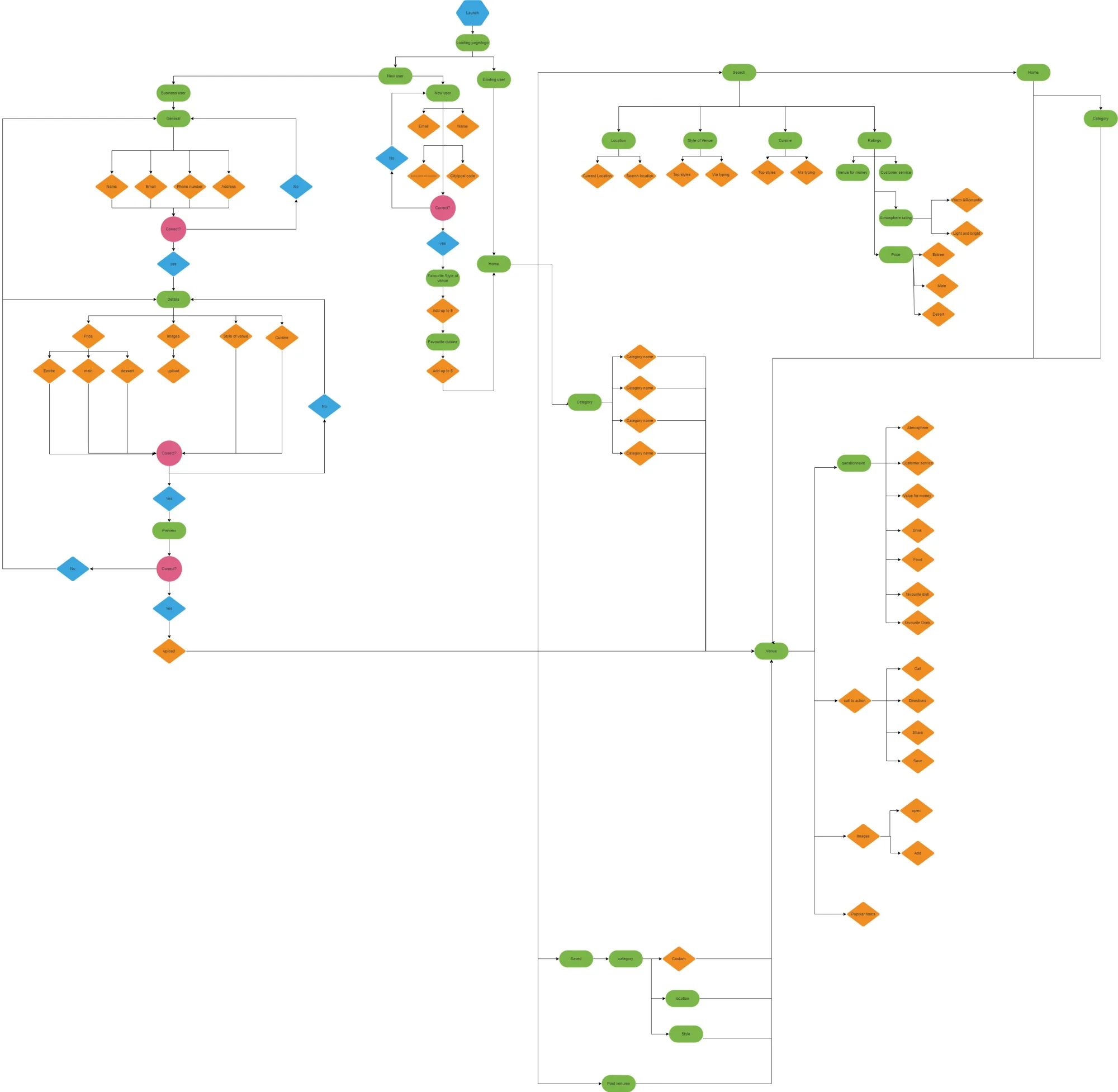
UI flow
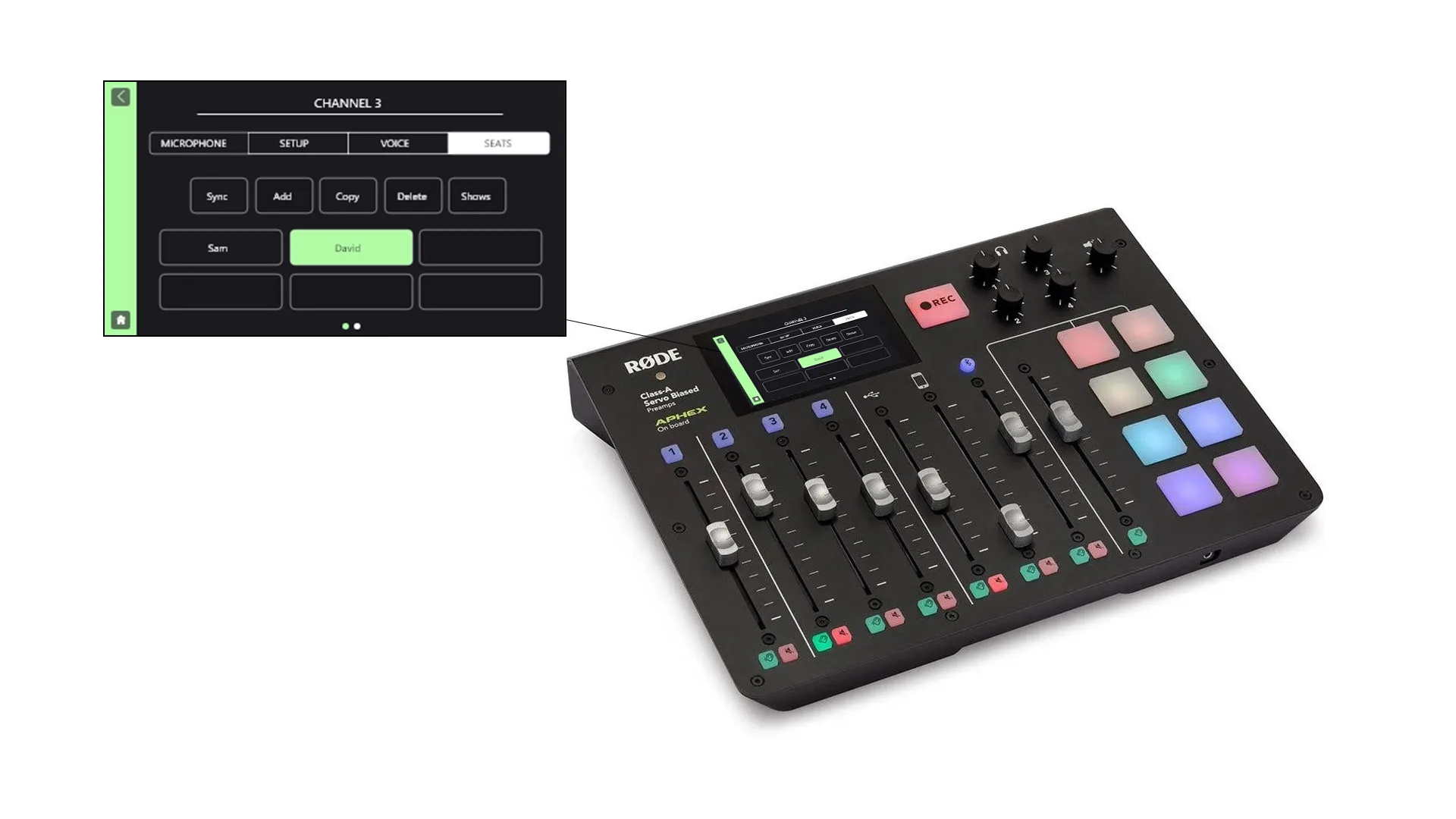
I mapped every screen state on the Caster's touchscreen to find where the Shows intervention belonged. The flow flagged the four-XLR section as the natural home for save and recall — the part of the workflow customers repeated most often.
Final design · Shows
The headline addition: a feature called Shows. A snapshot of every setting (gain, channel routing, sound-pad assignments) saved to a profile that can be reloaded any time. Multi-host setups, recurring guests, and live performances become a two-tap recall instead of a setup ritual.
A high-fidelity prototype carried the new feature into a working interaction model, including reworked iconography that matched the existing RØDE visual language while accommodating the new state.
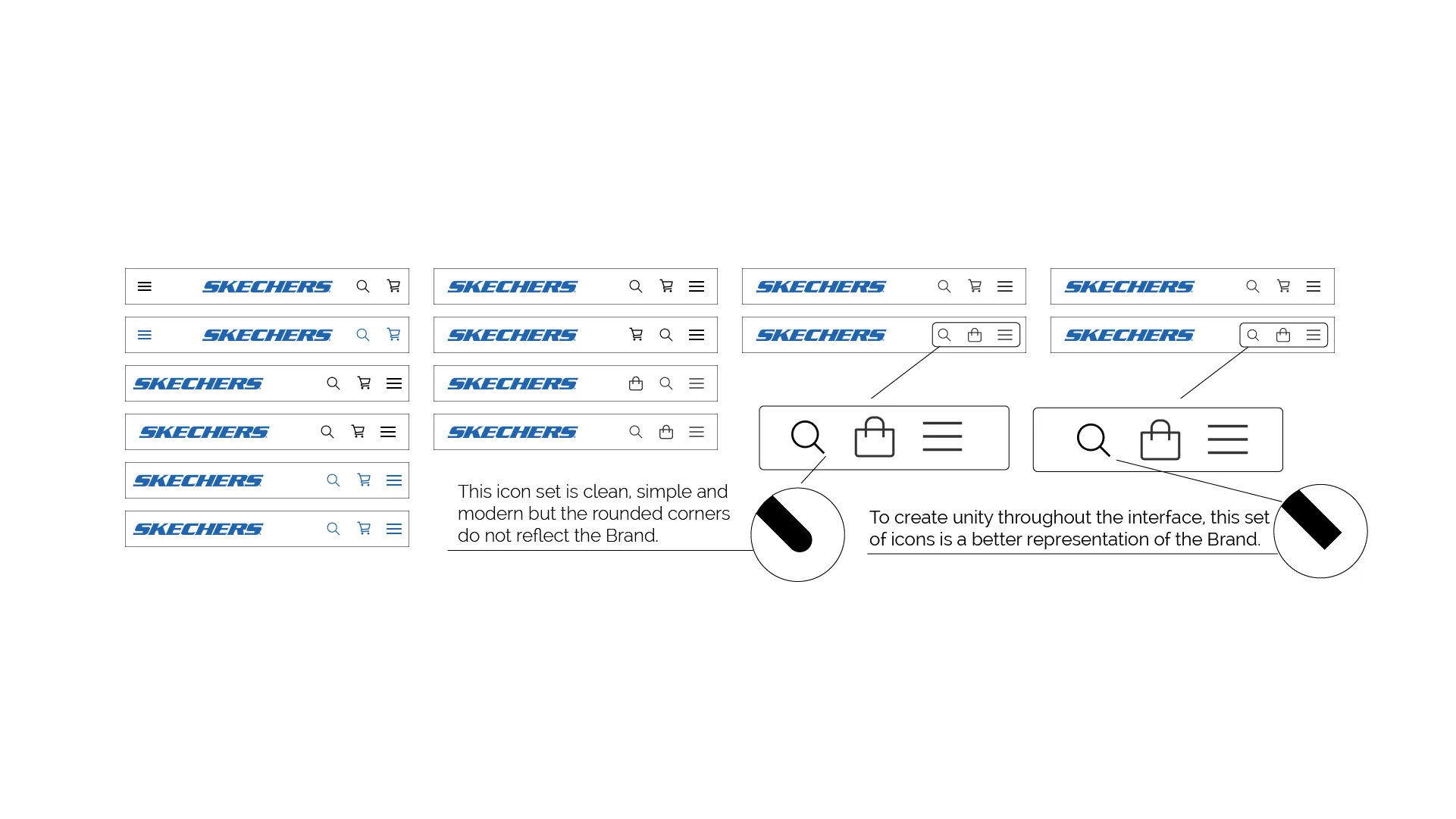
Iconography
I reworked the iconography to match RØDE's existing visual language while accommodating the new state — channel, save, recall, profile — each icon sitting inside the system the Caster already taught. The set carried into a high-fidelity prototype that kept the Shows feature feeling native to the console.
A two-tap recall replaces a fifteen-minute setup ritual.
What I learned
This was a self-directed UX study, so the constraint was self-imposed: solve a real problem without breaking the existing visual language. That tension shaped every decision — the iconography sat inside the existing system, the new screen used patterns the Caster already taught, and the feature itself ran parallel to the workflow rather than across it. Looking back, the lesson held up: additive design is harder than redesigning, and worth the effort.