 Michael Papanikolaou
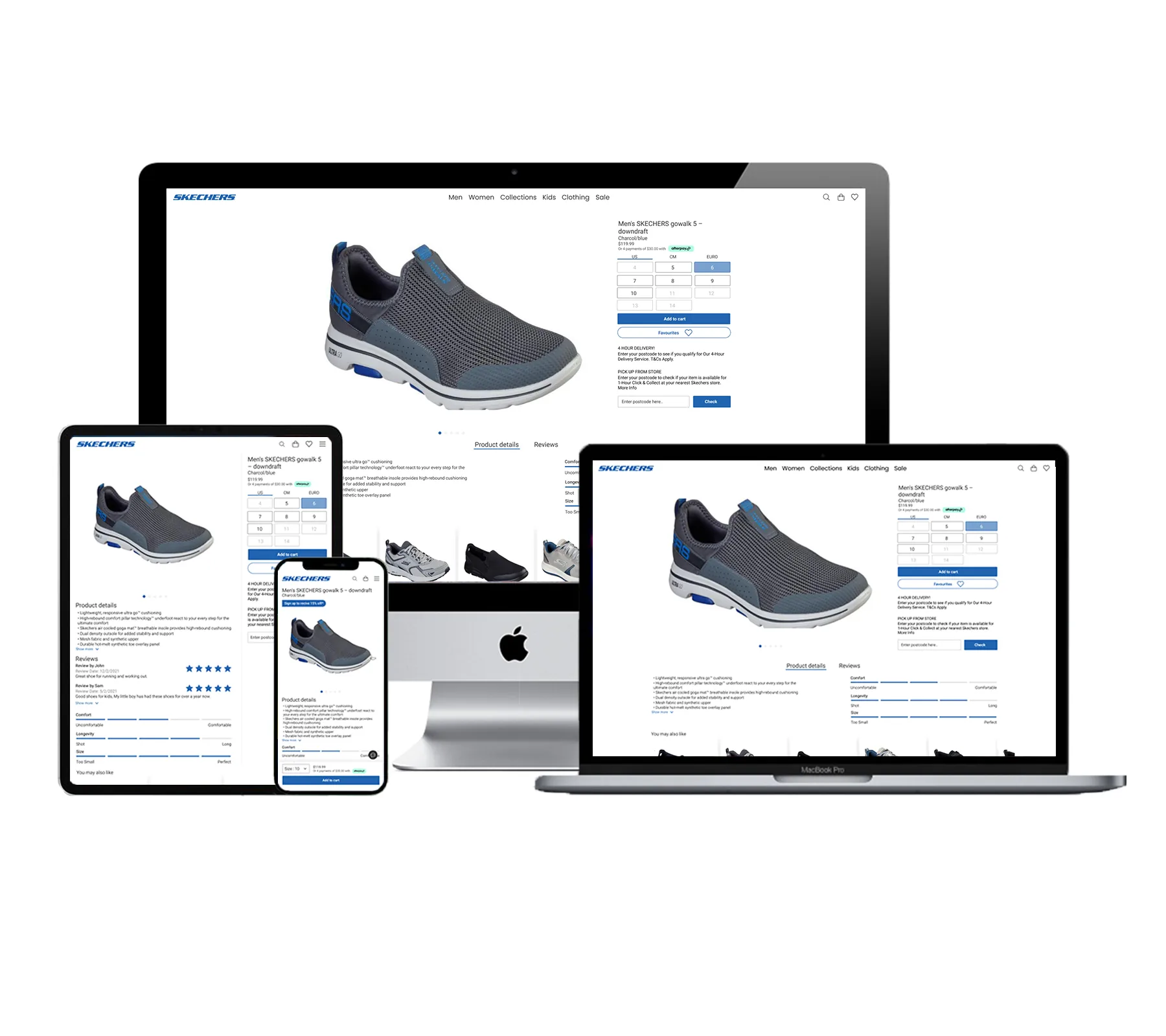
A PDP that lets the product breathe.
A product detail page redesign for Skechers (Accent Group). Mobile-first, scaling cleanly to desktop. Brand-led design, user-generated content, considered hierarchy.
Brief
I was asked to redesign the product detail page for Skechers, one of Accent Group's key brands, starting with the men's GOwalk 5 Downdraft. The PDP needed to read clean and simple on mobile first, then scale to desktop, with reviews and user-generated content carrying real weight in the purchase decision.
Problem
The existing Skechers PDP read as generic third-party catalogue. Product imagery fought with promotional banners for attention, sizing and add-to-cart sat below the fold on mobile, and reviews were buried in a tab most shoppers never opened. The header and footer carried none of the Skechers brand voice. The risk was clear: shoppers were defaulting to third-party retailers because the brand's own page gave them less reason to stay.
My role
I led the redesign end-to-end across mobile and responsive desktop:
- Audited the original PDP against the brief and against competing third-party retailers
- Three concept directions explored on mobile-first, then narrowed to one
- Iconography exploration for the top nav, aligned to the Skechers brand
- Final mobile design with hierarchy revised around imagery, sizing, and reviews
- Responsive scale-up from mobile to desktop on the chosen direction
What success looked like
Per the brief, success meant:
- Mobile-first experience that lets shoppers save the product for later
- Clear understanding of features and active promotions
- Other-shopper reviews surfaced as a primary purchase driver
- Strong reasons to buy direct from Skechers, not from a third party
- Header and footer revised to match the new experience
- Demonstrates how the design scales up to desktop
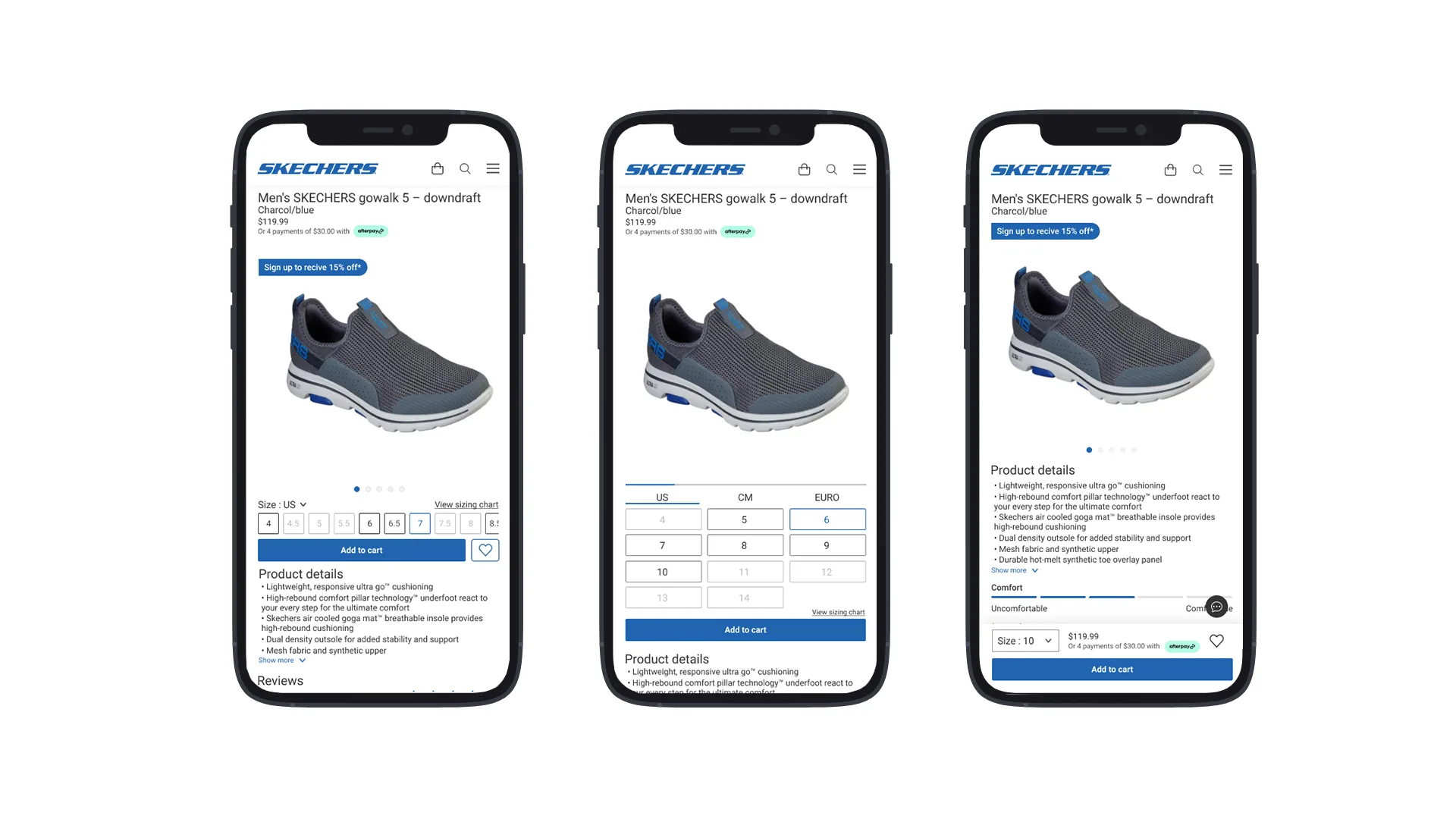
Three concepts
I ran three concept directions on mobile, each carrying a different point of view on hierarchy, imagery, and how reviews fit into the page. I assessed each against the brief and against shopper behaviour I saw on competing third-party PDPs, then narrowed to the one direction I took into responsive.
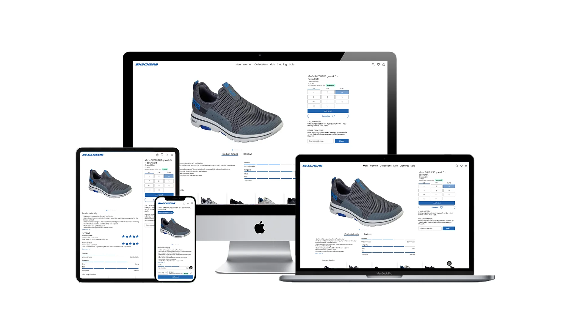
Final design
The final design carries product imagery as the primary surface, sizing and purchase actions visible above the fold on mobile, and reviews promoted as the social proof Skechers shoppers actually look for. The same hierarchy carries up to desktop without losing what the mobile-first work earned.
What I learned
Mobile-first wasn't a layout choice on this brief; it was a hierarchy choice. Once imagery, sizing, and reviews earned their slots above the fold on mobile, scaling up to desktop became a question of where to give the imagery more room, not a redesign.
The top nav taught me how much brand a small detail can carry. Square-cornered icons looked unremarkable on their own; sat in the header, they shifted the whole page from generic catalogue to Skechers.