Rebuilding a B2B made-to-measure platform for market lead, and acquisition.
A live garment visualiser, ten render-fallback scenarios, and a phased rollout that protected ~200 daily users at the largest tenant. The surface where tailors meet clients, rebuilt to acquisition grade.
Brief
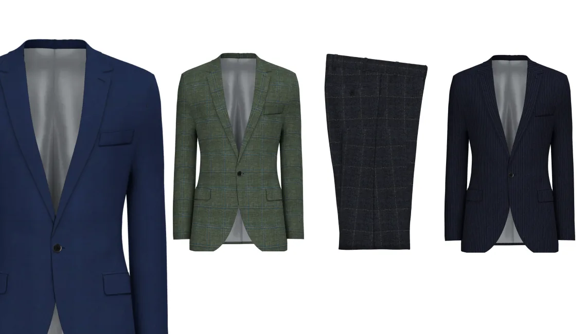
Taper powers made-to-measure programs for global menswear retailers. The configurator is the sales surface itself, used by a tailor standing shoulder-to-shoulder with a client. Leadership wanted the whole flow rebuilt to acquisition grade: faster at the point of sale, configurable per tenant, and ready to onboard the next wave of stores. At the centre of the rebuild, a garment visualiser — built to support the tailor's craft, and let the client see every detail of the suit before it was cut.
Problem
The old flow was dense and slow at the point of sale. Conflicts surfaced as scattered alerts. Repeating a single choice across a 3-piece order meant dozens of clicks. The summary couldn't be printed cleanly. Training ran on a separate stack from production, so tailors learned one product and sold another. And tailors couldn't show a client what a garment would look like before it shipped — competitors already could. Market parity and white-glove polish, on the same surface.
My role
I led the rebuild end-to-end, from kickoff workshop through phased rollout:
- Ran the kickoff workshop with engineering and product (FigJam board)
- User-tested with tailors to keep the new flow in step with their craft, not in the way of it
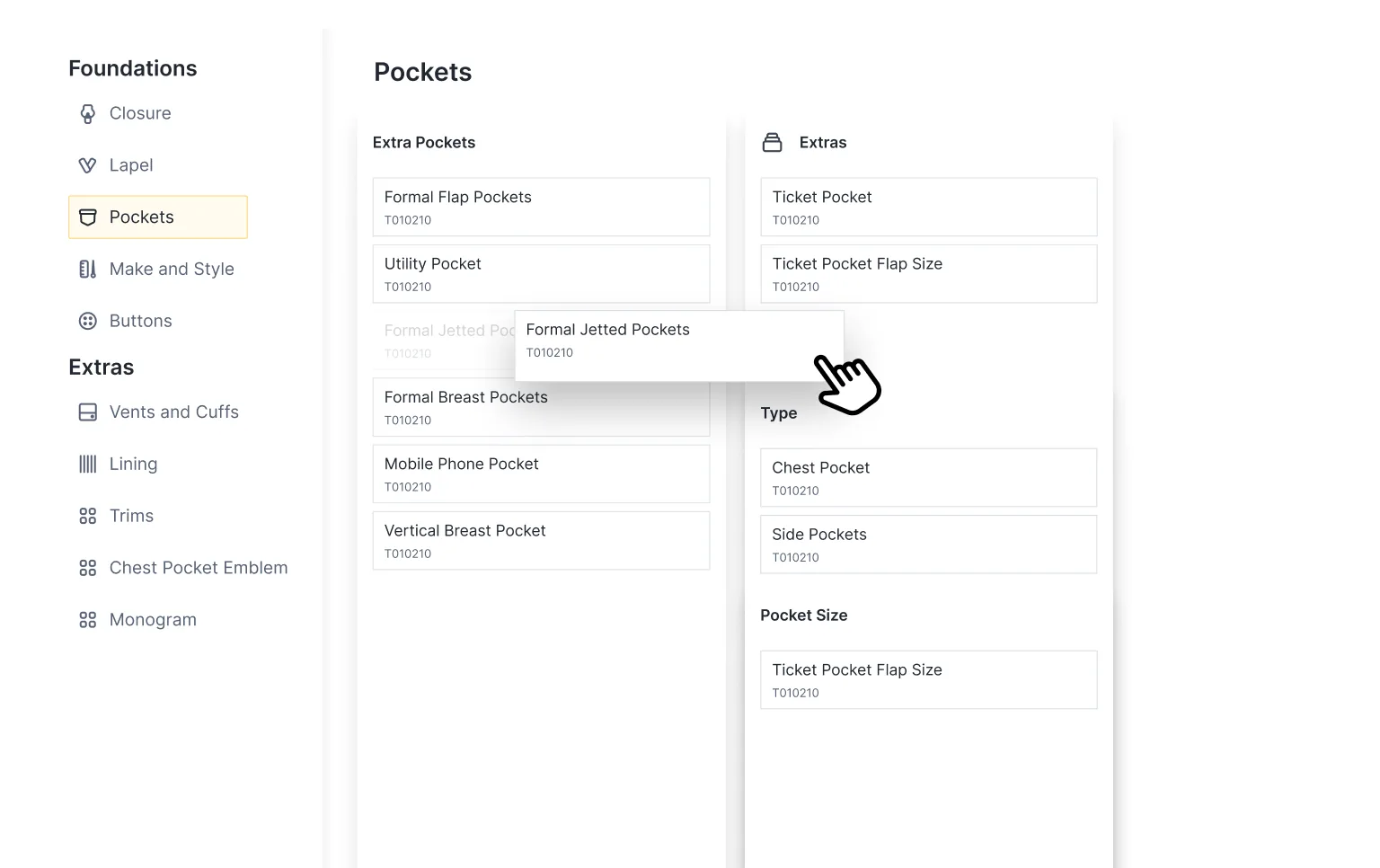
- Owned the design system for the new flow: 30+ option components
- Designed the ten render-fallback scenarios end-to-end
- Designed test mode so tailors could try the new surface without giving up time on the floor — the mechanism the phased rollout ran on
- Worked with engineering on render integration and conflict-routing logic
Acquisition-grade investment in the platform's most-used surface.
A deliberate uplift to reach parity with the only render-based competitors in B2B made-to-measure, and to settle a backlog the old flow had accumulated: conflict noise, repetitive clicks, unprintable summaries, a training stack drifting from production. Three tenants — including the largest, ~200 daily users — transitioned without disruption. The work positioned the product for strategic acquisition, and became the foundation later tenants migrated onto.
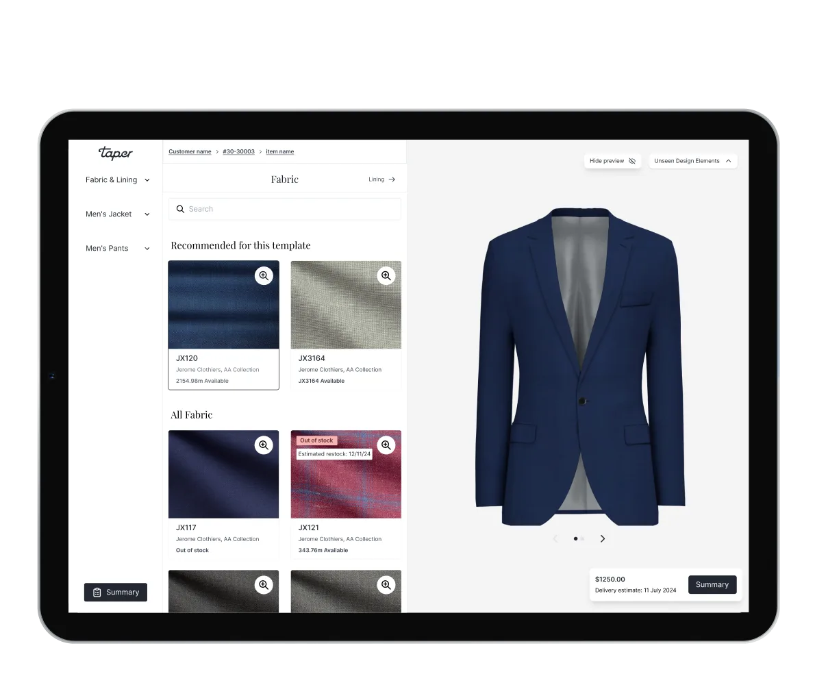
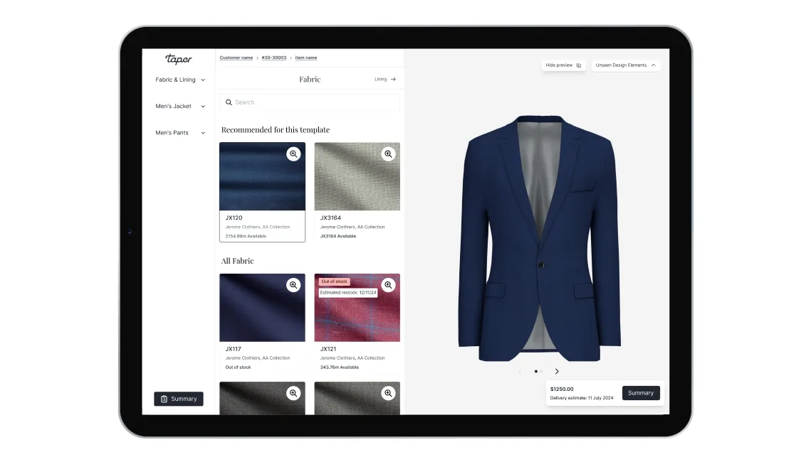
The visualiser
Render on the left, configuration on the right. The garment updates as the tailor changes the lapel, lining, button, fabric. Industry-standard in B2C, new in this corner of B2B. Clients finally see what they're buying before it's cut.
Designed for the sales floor
Full-window from the moment an item enters the order. No nav, no admin chrome — just the garment and the decisions around it. Built for desktop and tablet, because that's where tailors actually stand: laptop on the cutting bench, iPad in the showroom. Mobile waits its turn until in-store earns the lift.
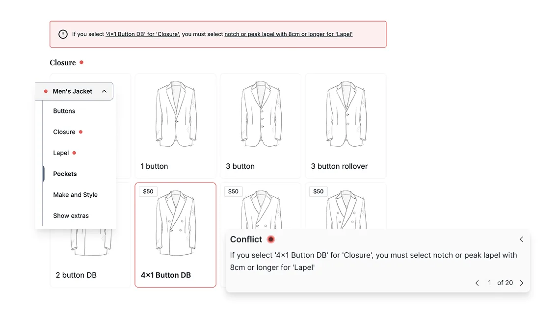
Conflict summary + anchor routing
Conflicts used to scatter across the page as separate alerts, each one breaking the tailor's train of thought. Now they collect at the top, and a click anchors straight to the section that needs attention. Linter UX, not form validation — fixable in one click, skippable when context calls for it.
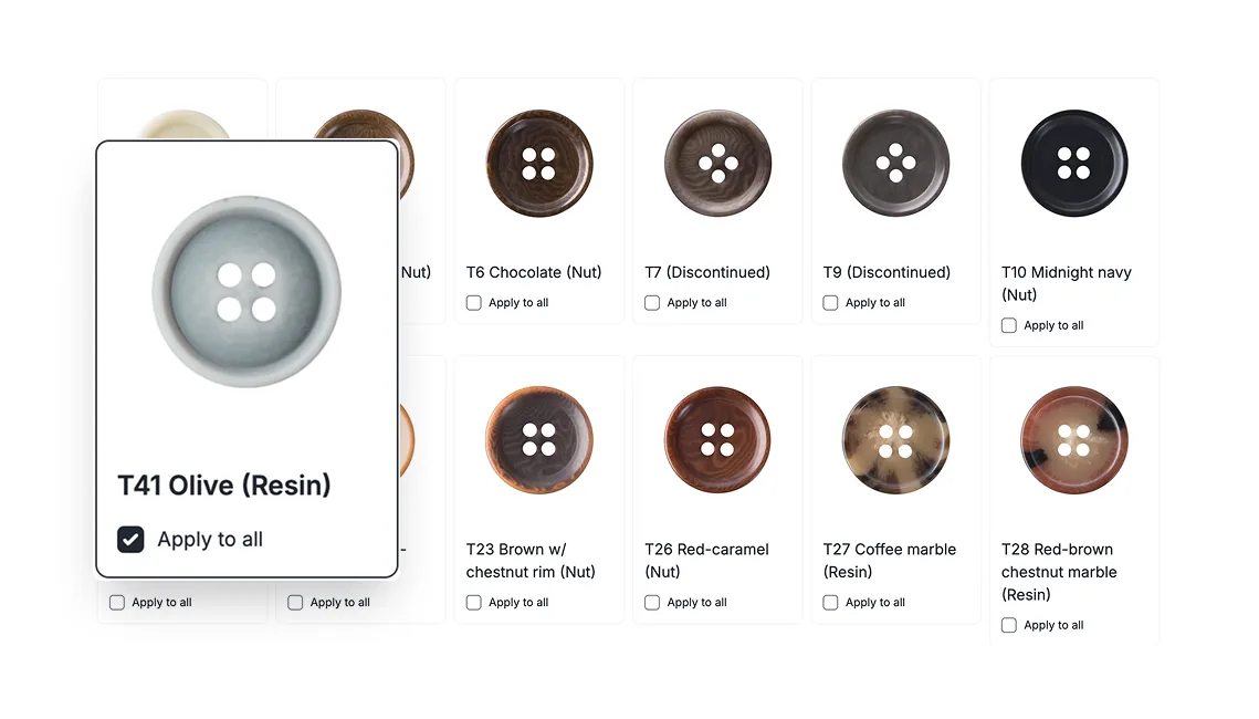
Apply-to-all
On a 2- or 3-piece suit, buttons and linings usually want to match across every garment. One selection now propagates across the order: dozens of clicks saved, the most common conflict pre-empted, and the tailor freed to talk about the cloth instead of the form.
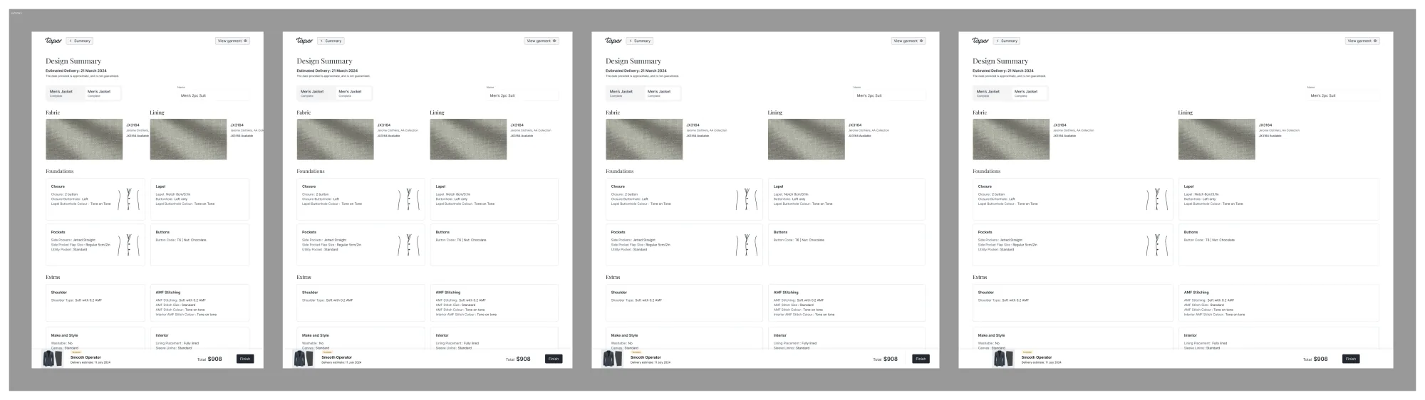
Summary view
Every decision in one place: fabric, lining, design, fit, conflicts, delivery, price. Designed to print clean — the printout is what the client signs off in-store, and the record the workshop cuts from.
Render details
Zoom into any area of the render to inspect it up close — useful for explaining a stitch, a closure, a fabric weave without losing the rest of the suit. The kind of detail a tailor would normally point at on a sample.
Admin configurations
Each tenant configures its own product range, fabrics, linings, and options. Operations tunes the experience per showroom and adds new product lines without engineering — the difference between a sales tool and a platform.
Show / hide rendering
The render isn't always wanted on screen. Scrolling options, explaining a fit decision, a room that wants the conversation in front of the picture — a toggle collapses the render and gives the design panel the full window.
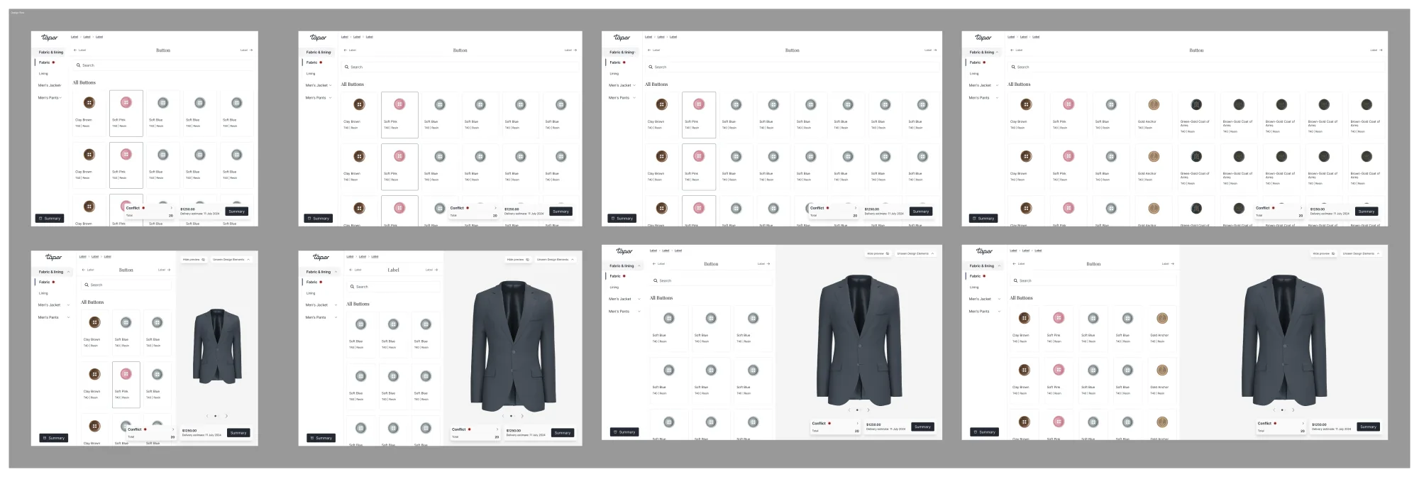
Test mode
Training and live used to be two different products. Tailors learned one set of options in training and met another on their first live order — confusing for them, expensive for the business, and a quiet source of bugs whenever the two stacks drifted apart.
Test mode replaces it. Same options as live, clearly flagged, one click from production. Easier for tailors learning on the real surface, easier for stores onboarding new reps without leaving the system they sell in, and the old training infrastructure gets decommissioned along the way.