 Michael Papanikolaou
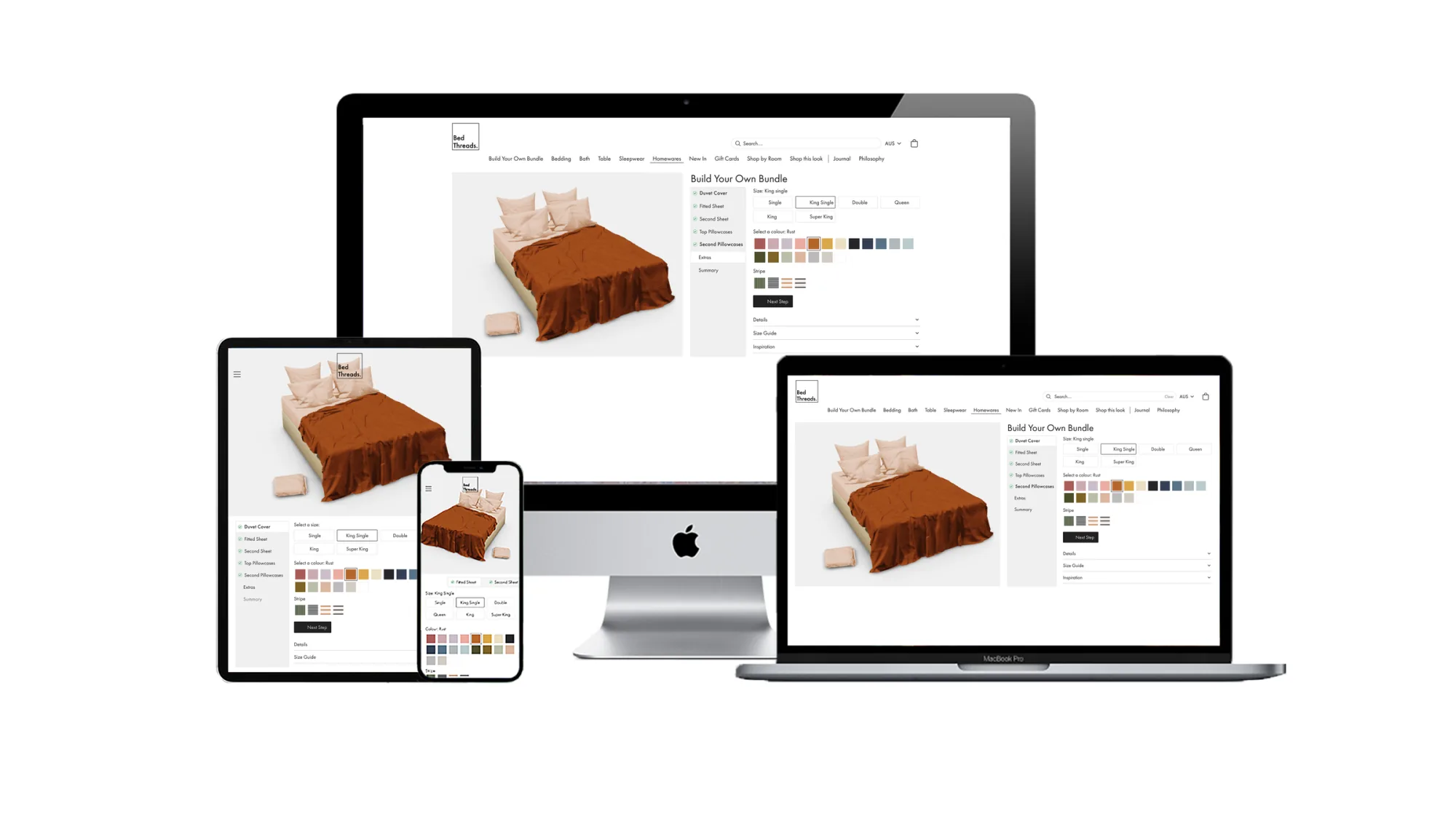
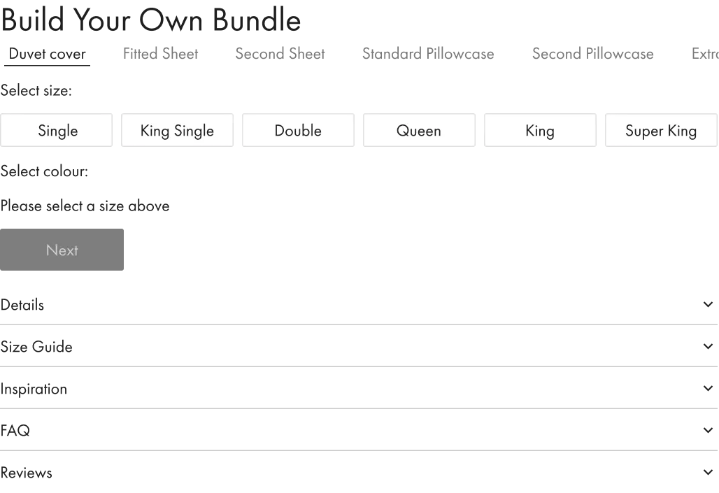
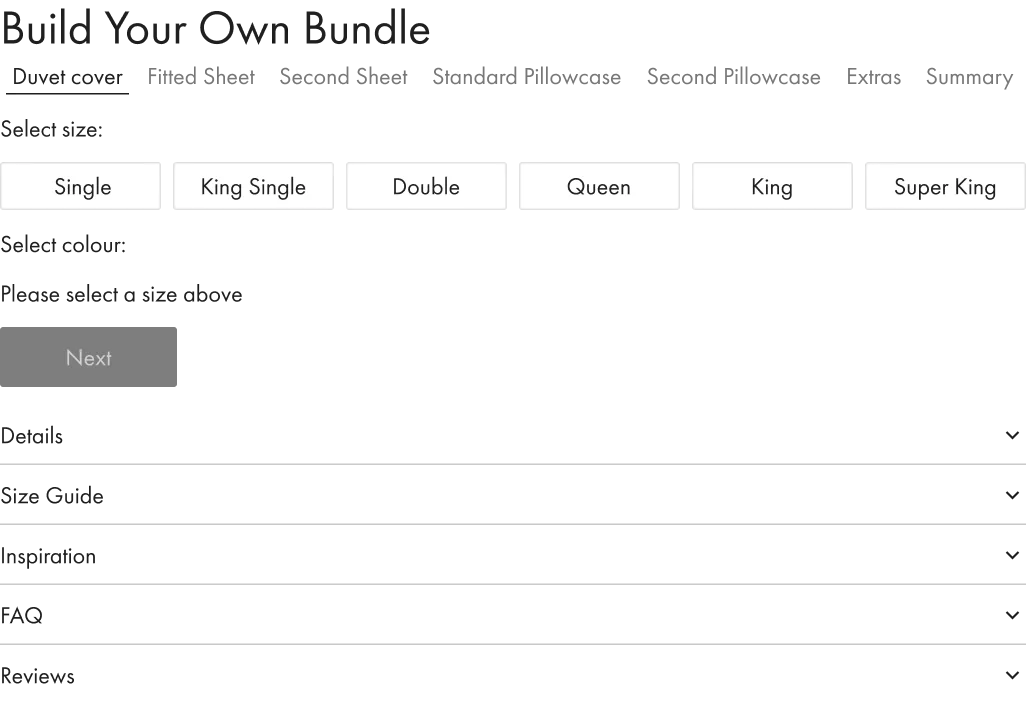
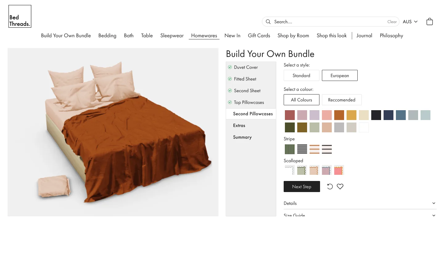
Build Your Own Bundle.
Designing Bed Threads' Build Your Own Bundle from MVP to production. Lateral thinking turned a dropdown into an experience that lifted average order value by $128. Direct competitors used it as 'inspiration' for their own.
Brief
Take Bed Threads' Build Your Own Bundle from a working MVP to production. New colours were the focus of the 2021 range, so the configurator needed to scale with the catalogue without breaking the mobile flow that drove most of the bundle traffic.
Problem
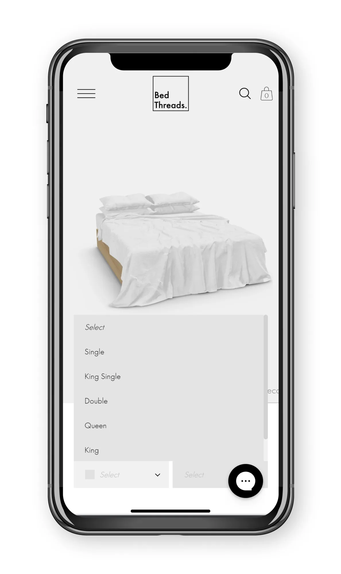
The original picker was a single dropdown. As the palette grew it would keep lengthening, force more scroll, and bury the size step behind the colour decision. Mobile users were dropping off at exactly the moment the configurator should have felt like the most engaging part of the site.
My role
As UX/UI Designer I owned the experience end-to-end:
- Audit of the original picker and the live MVP against Hotjar behaviour
- Blind usability sessions via userbrain.com plus moderated user interviews
- Competitive read of two direct competitors that had adopted the BYOB pattern
- Lateral-thinking ideation that broke the linear progress bar
- Mobile and desktop final design including progressive disclosure and the live 3D render
- Annotated developer hand-off and QA
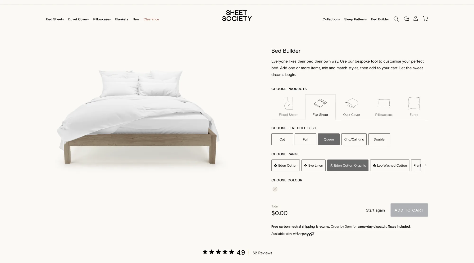
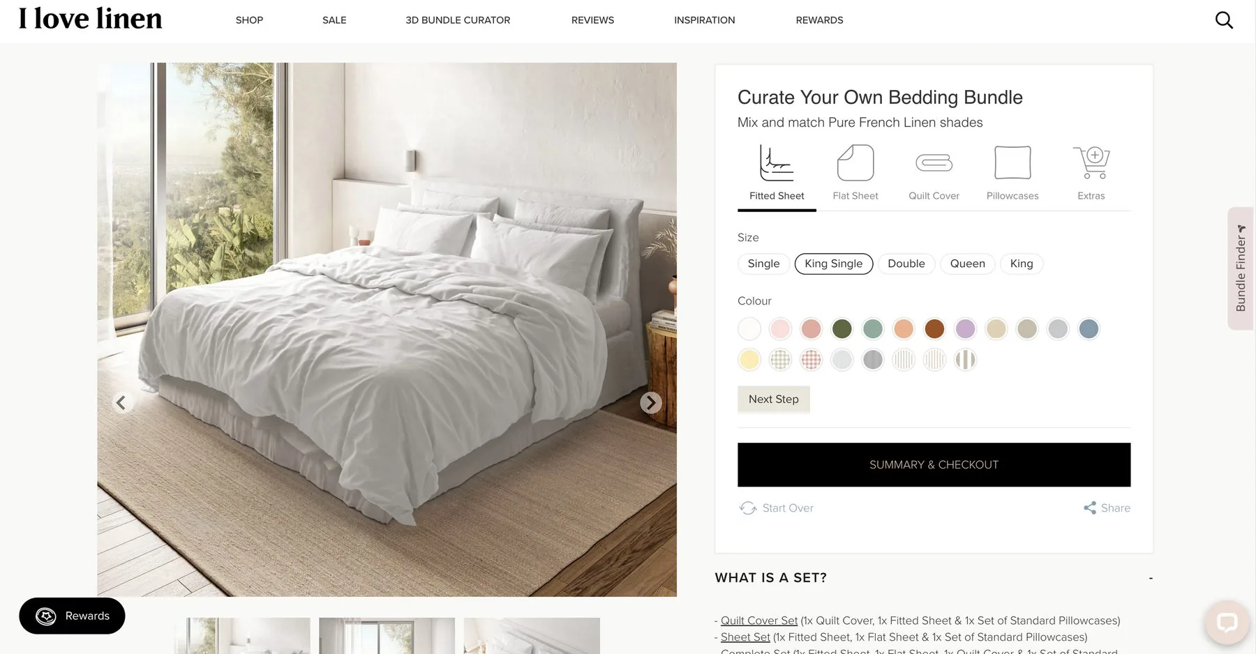
Set the market standard for bundle visualisers.
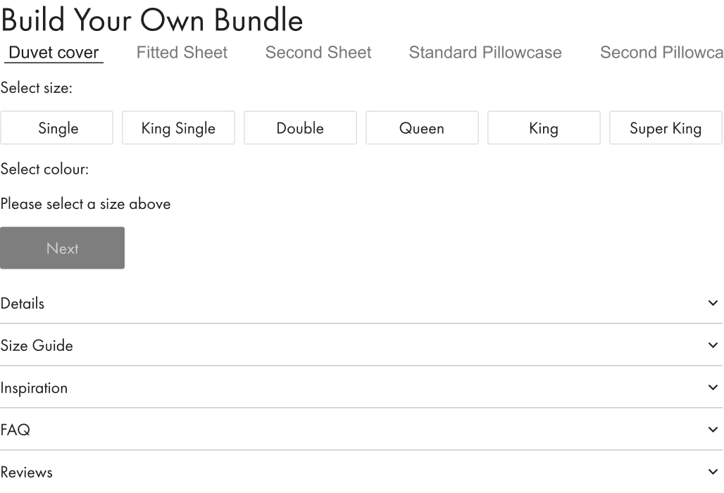
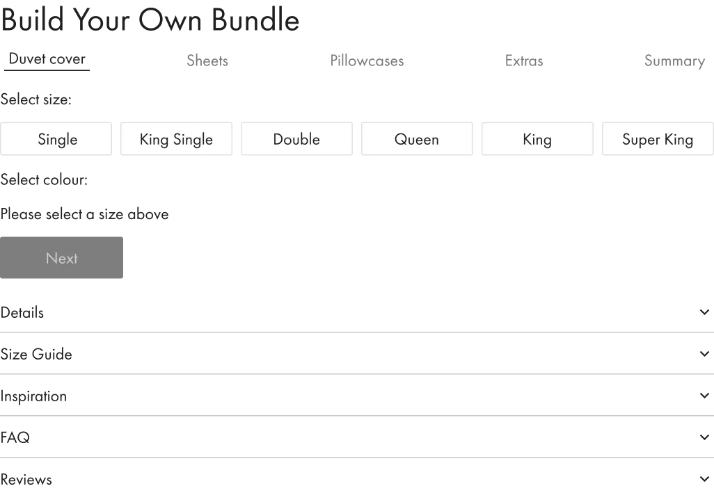
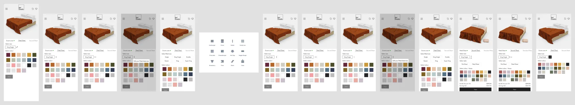
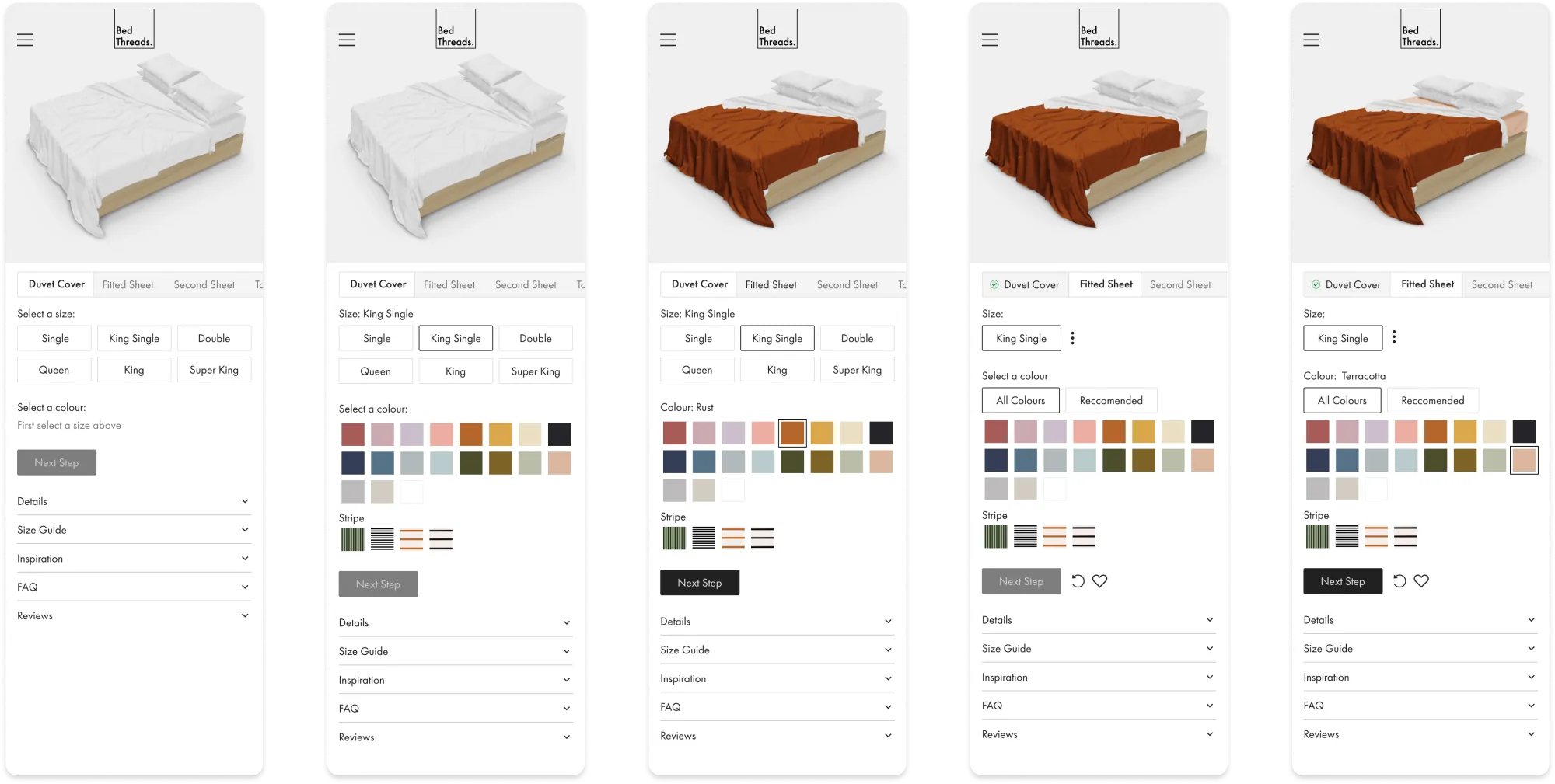
Original, MVP, Final
- The original design required users to select one colour from a dropdown menu. With new colours launching as a 2021 focus, that dropdown would keep lengthening and require further scrolling.
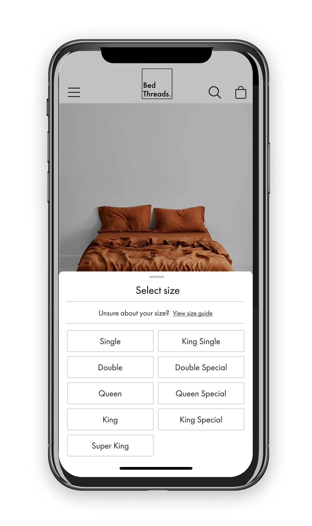
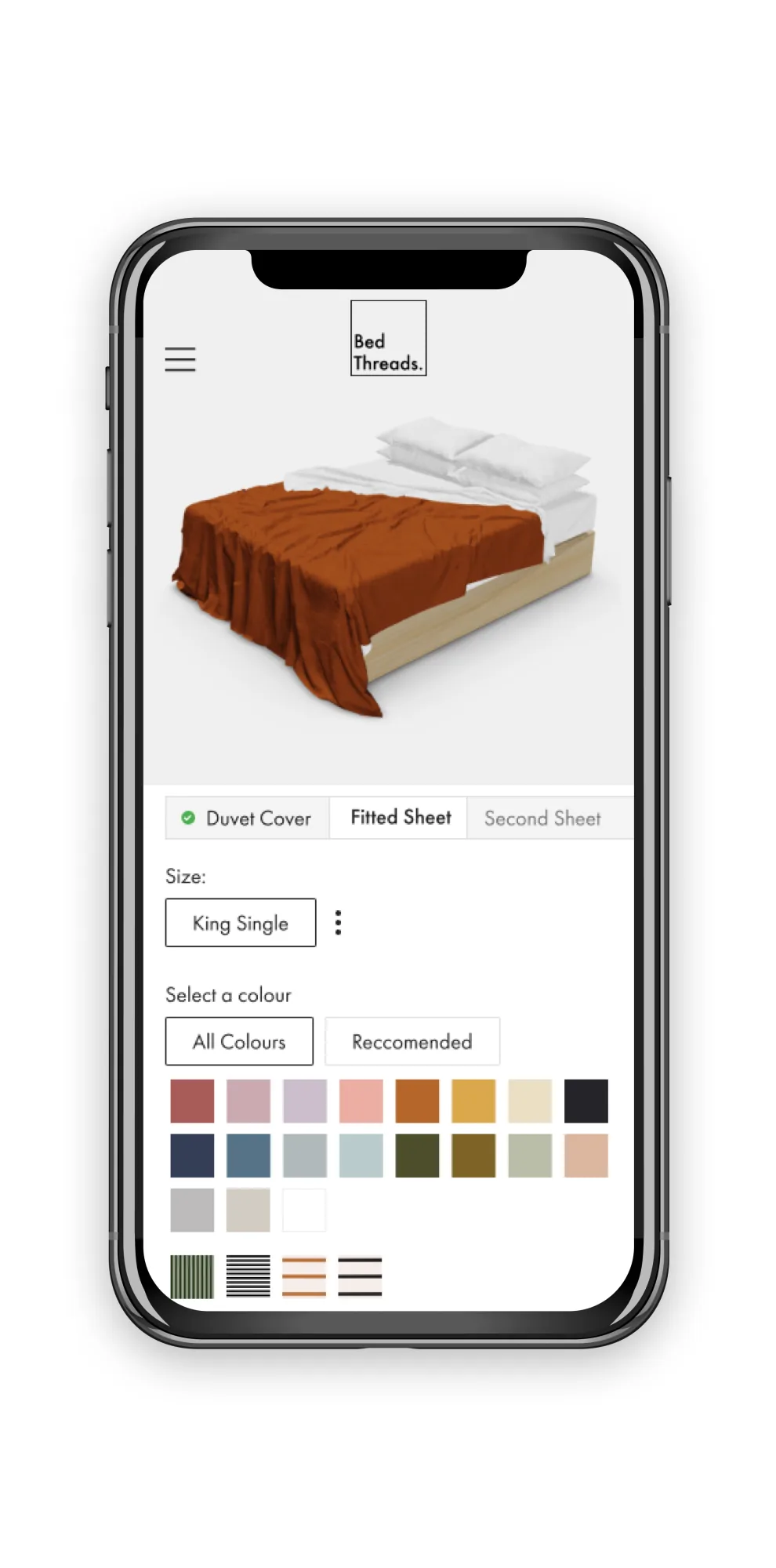
- Expanding colours into swatches in the MVP introduced gamification and creativity, and increased the usability of the experience.
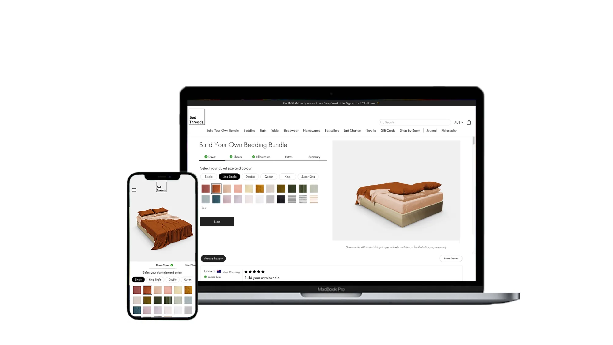
- The final replaced the swatch row alone with progressive disclosure and a live 3D render, so the bundle built itself in front of the customer as each step resolved.
Testing
Goals: assess the usability of the BYOB experience on mobile. Gather initial insights, build assumptions, and validate them in follow-up tests. The output: insights to make design and functionality improvements.
Method: blind user sessions via userbrain.com and user interviews.
Insight: users got "excited" at the colour step and missed sheet-size selection further into the flow. That single behaviour became the trigger for the progressive-disclosure pattern in the final design.
Market-leading MVP
After launching, direct competitors used the Bed Threads BYOB as 'inspiration' for their experiences. Some executed features better than our MVP. That let me conduct blind usability testing against the copies, and use those findings to push the experience further.
MVP review
I conducted a detailed review of the design to surface areas of opportunity. Inconsistencies between the mobile and desktop progress bar stood out, alongside other usability problems uncovered through Hotjar and follow-up testing.
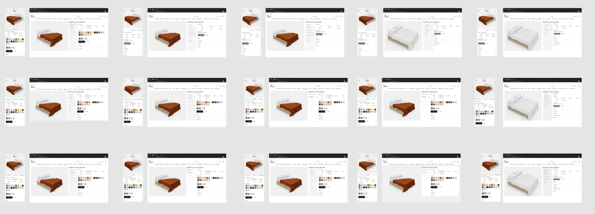
Progress bar
The progress bar imagery below shows the inconsistencies across the mobile and desktop experience. The sheets and pillowcases steps in particular were a focus of the redesign.


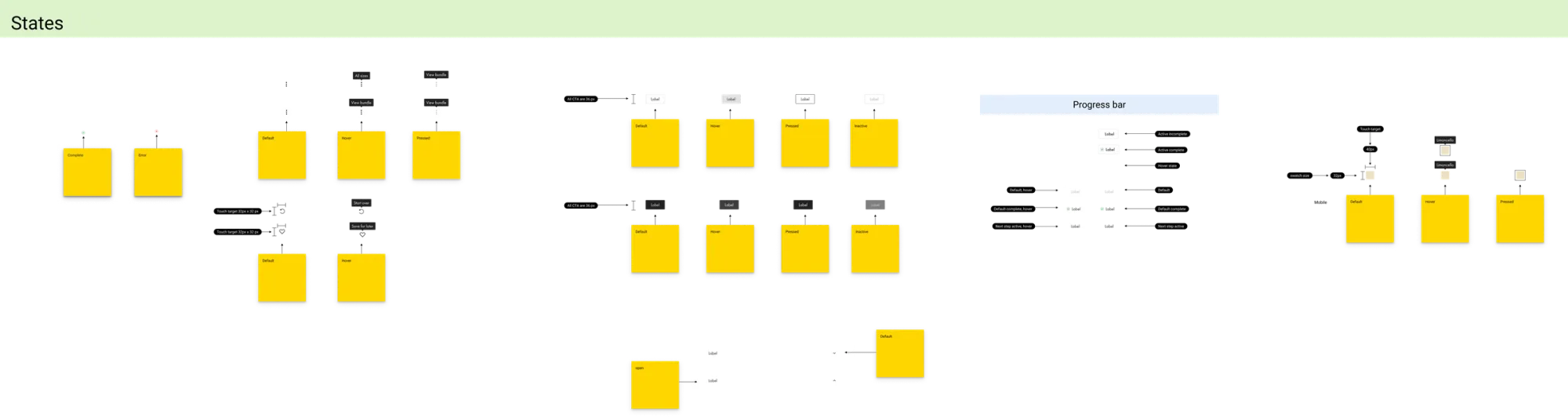
Progress-bar ideations
Designing a progress bar that moved linearly on desktop wouldn't solve the inconsistency. In some ideations the font was too small for a sub-heading, or steps sat too close together to read.
Problem solving
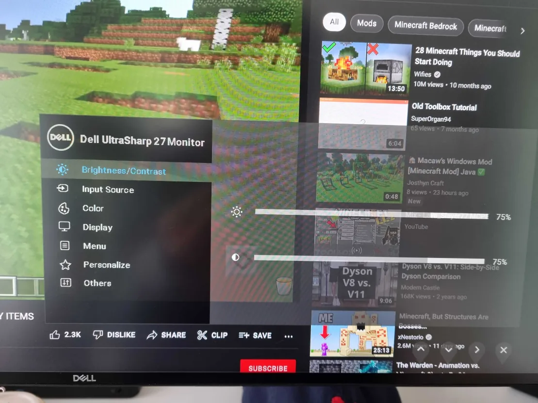
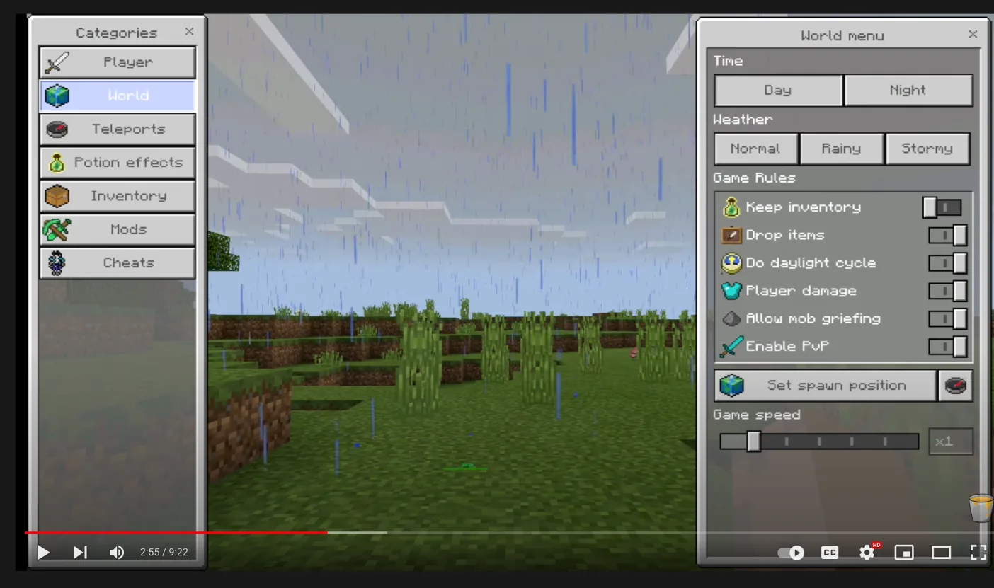
I needed lateral thinking to crack this. I found inspiration in how Gmail, Wix, Minecraft, and the settings menu on my monitor lay out their options. They stack and move left-to-right. Why does the progress bar need to move linearly? It doesn't. It can progress vertically, with options stacked.
Desktop progress-bar ideations
Exploring placement of the signifier and the overall UI for the desktop progress bar.
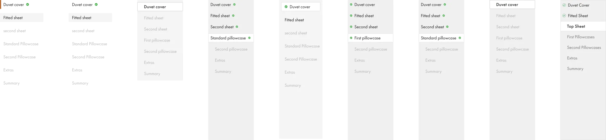
Progress bar · desktop
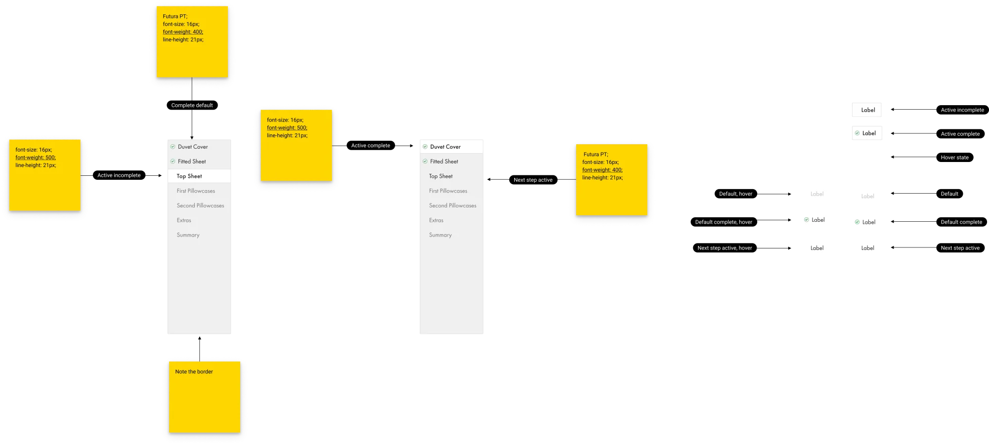
The lateral-thinking insight resolved into a vertically-stacked indicator on the left, with the live render holding the right-hand workspace. Steps progress top-to-bottom on desktop and the same logic carries over to mobile, so the two patterns finally read as one experience.
Select-size ideations
The size step was where mobile users were most likely to skip ahead. These frames explored how to make the choice visible without breaking the rhythm of the colour-led flow.
Concept refinement
Ideation and refinement of the concept across mobile and desktop.
Developer notes
Annotated specs covered the progress-bar interaction states, swatch-tap behaviour across breakpoints, and the conditional logic between step completion and the live 3D render. The hand-off doc became the squad's source of truth across engineering and QA.
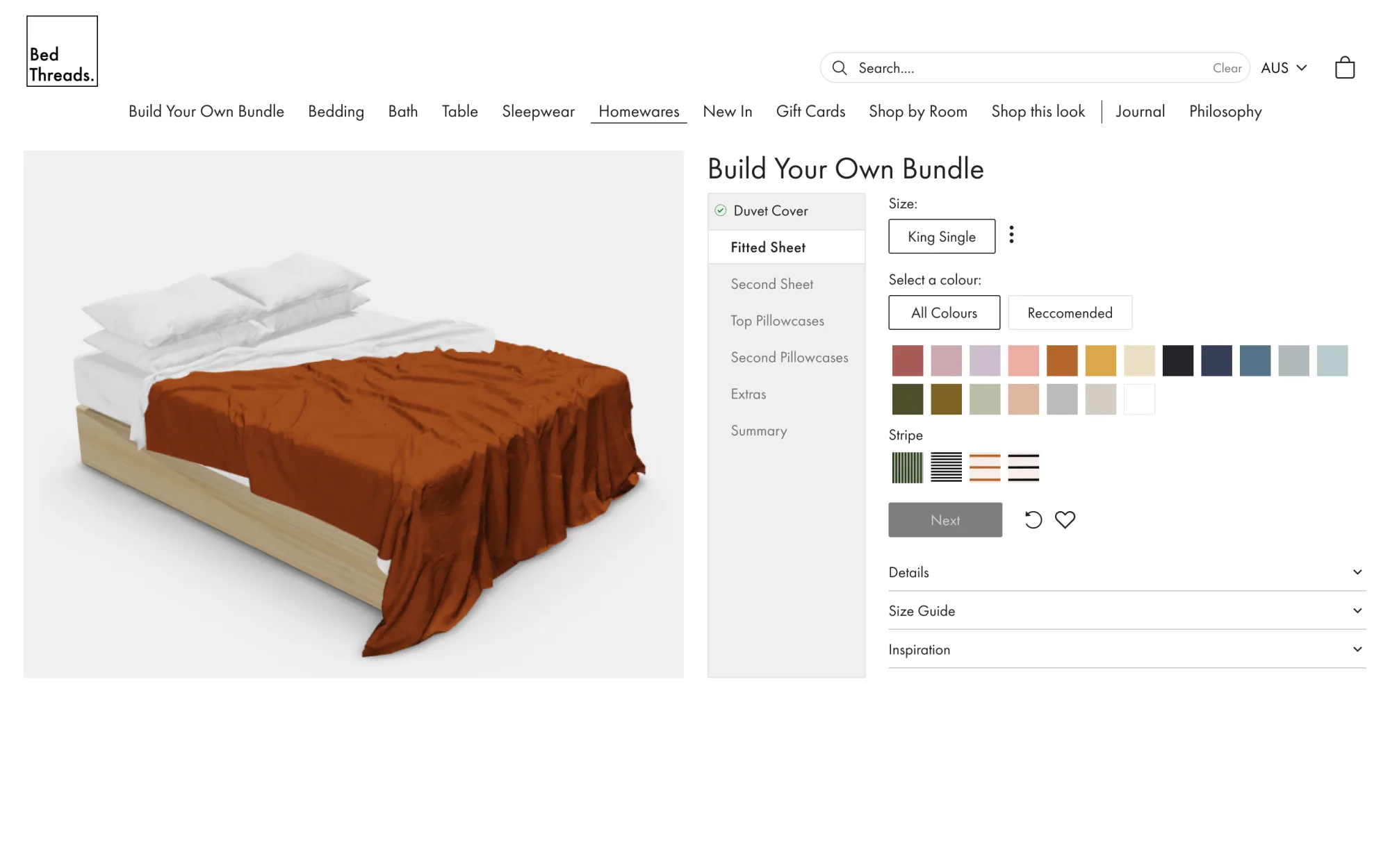
Final design
Progressive disclosure
Through testing I noticed that users were getting "excited" about the colour options and missing steps further into the flow. I used progressive disclosure to break larger steps into manageable tasks.
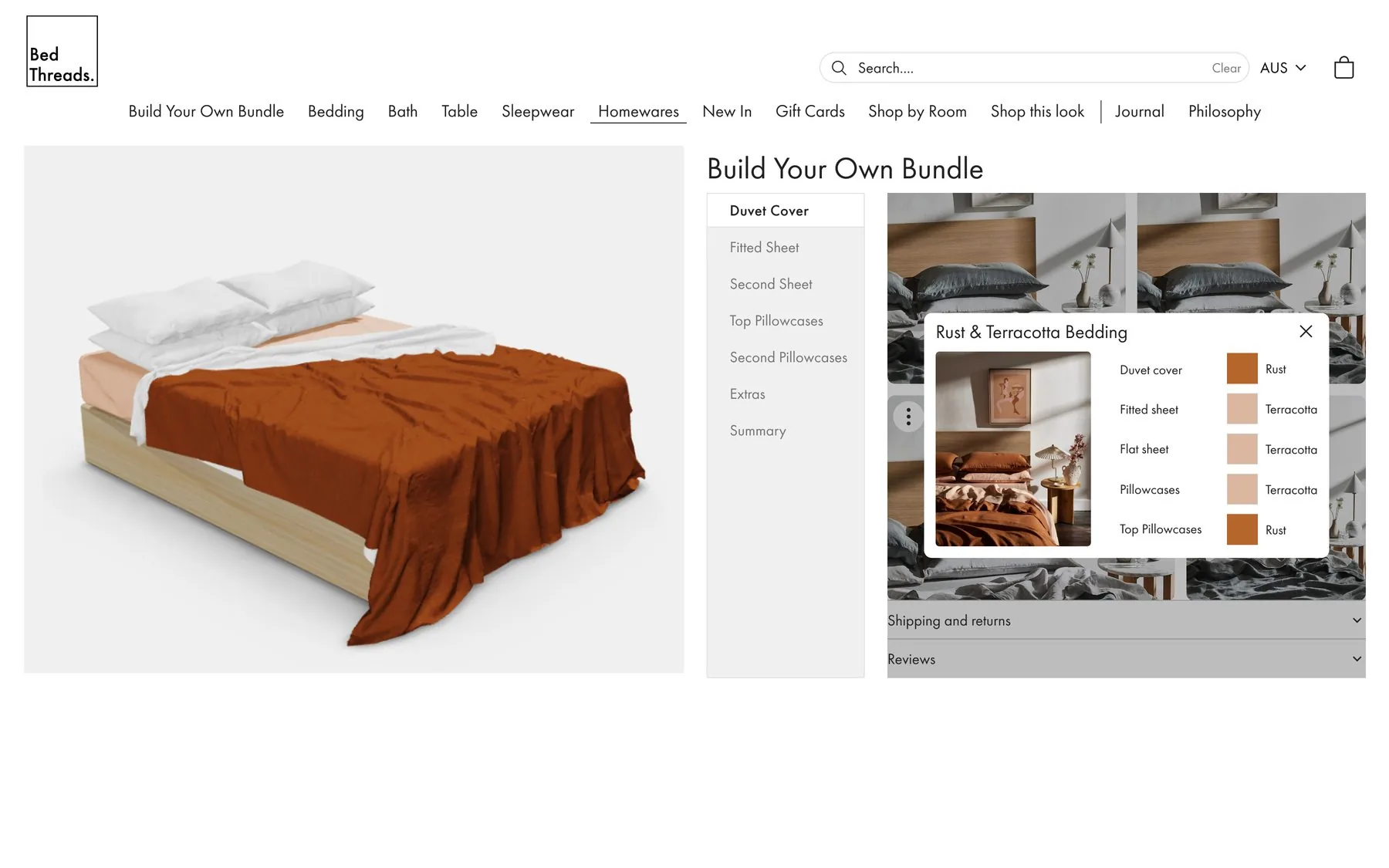
Desktop
The right-hand 'workspace' allows the user a more efficient workflow. The inspiration pop-up lets them compare the live render to inspiration imagery side-by-side, reducing amended orders post-purchase and saving the business money.