A redesigned accounts and returns experience for a global e-commerce brand.
I led the redesign of Hello Molly's account dashboard and post-purchase flow, research to handoff, for an e-commerce brand shipping globally.
Context
This project focused on developing an e-commerce dashboard that carries customers through their journey, from browsing products to managing returns.
Problem
The existing dashboard and returns process were overly complex and lacked usability, causing frustration for users when managing their accounts and returns. The convoluted navigation pushed users to customer support for tasks that should have been straightforward, and customer satisfaction suffered for it.
My role
As Senior UX/UI Designer for this project, I led the entire experience design process:
- Scoping and road mapping
- Stakeholder workshops
- UX research (quantitative and qualitative)
- User testing
- User journey mapping, UI flows, personas
- End-to-end design: wireframes, low-fi to mid/hi-fi, interaction design
- Quality assurance
Final designs
A unified accounts and returns experience across mobile and desktop, with a shared component library, accessible interaction patterns, and behavioural states for every order/return scenario including the unhappy paths.
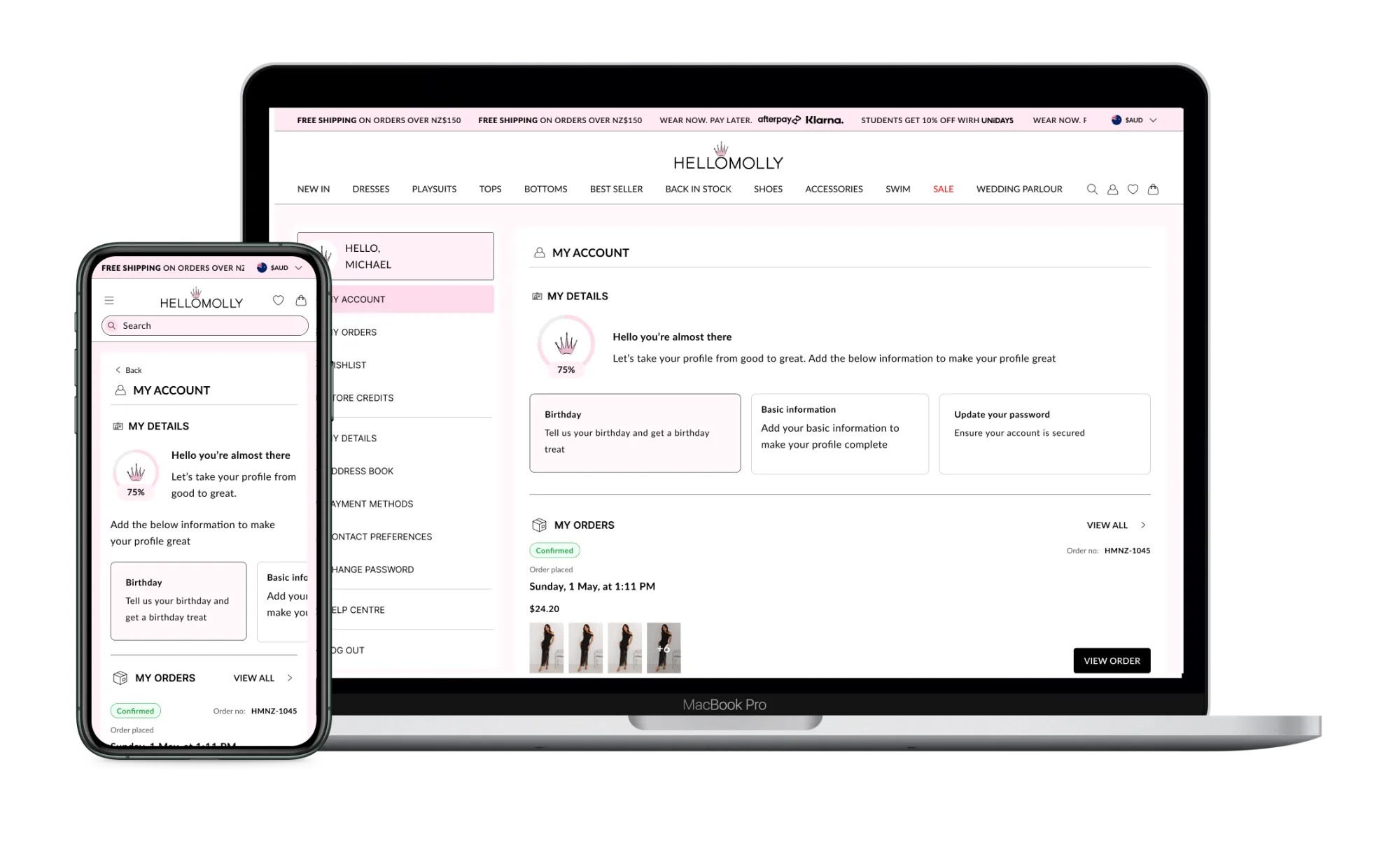
My accounts
Profile completion was sitting under 30%. Mandatory fields kill conversion; "complete your profile" prompts get ignored. We took a third route: a persistent module that trades specific data for specific rewards: date of birth for a birthday discount, dress size for sizing-aware product suggestions. The framing matters as much as the mechanic.
Result: a 15% increase in profile completion, plus higher-quality first-party data feeding the rest of the brand's CRM.
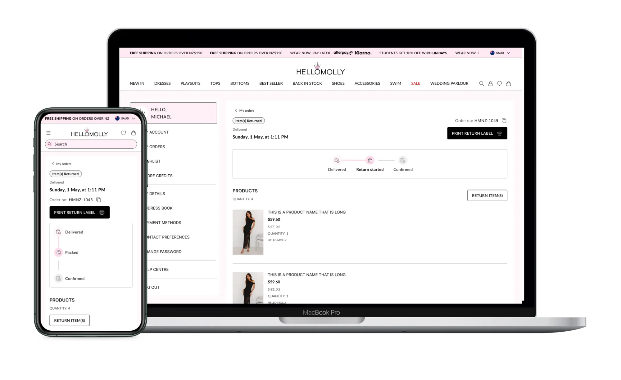
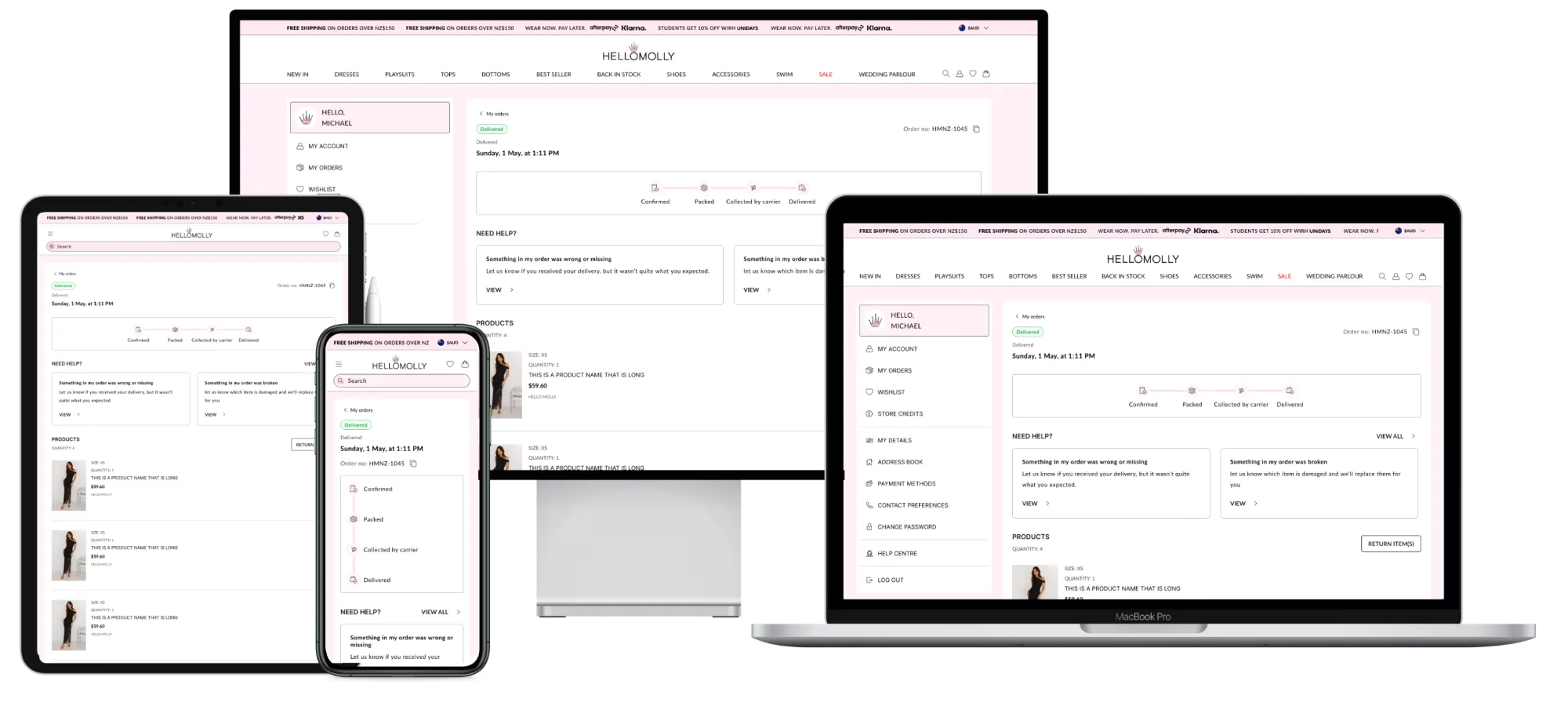
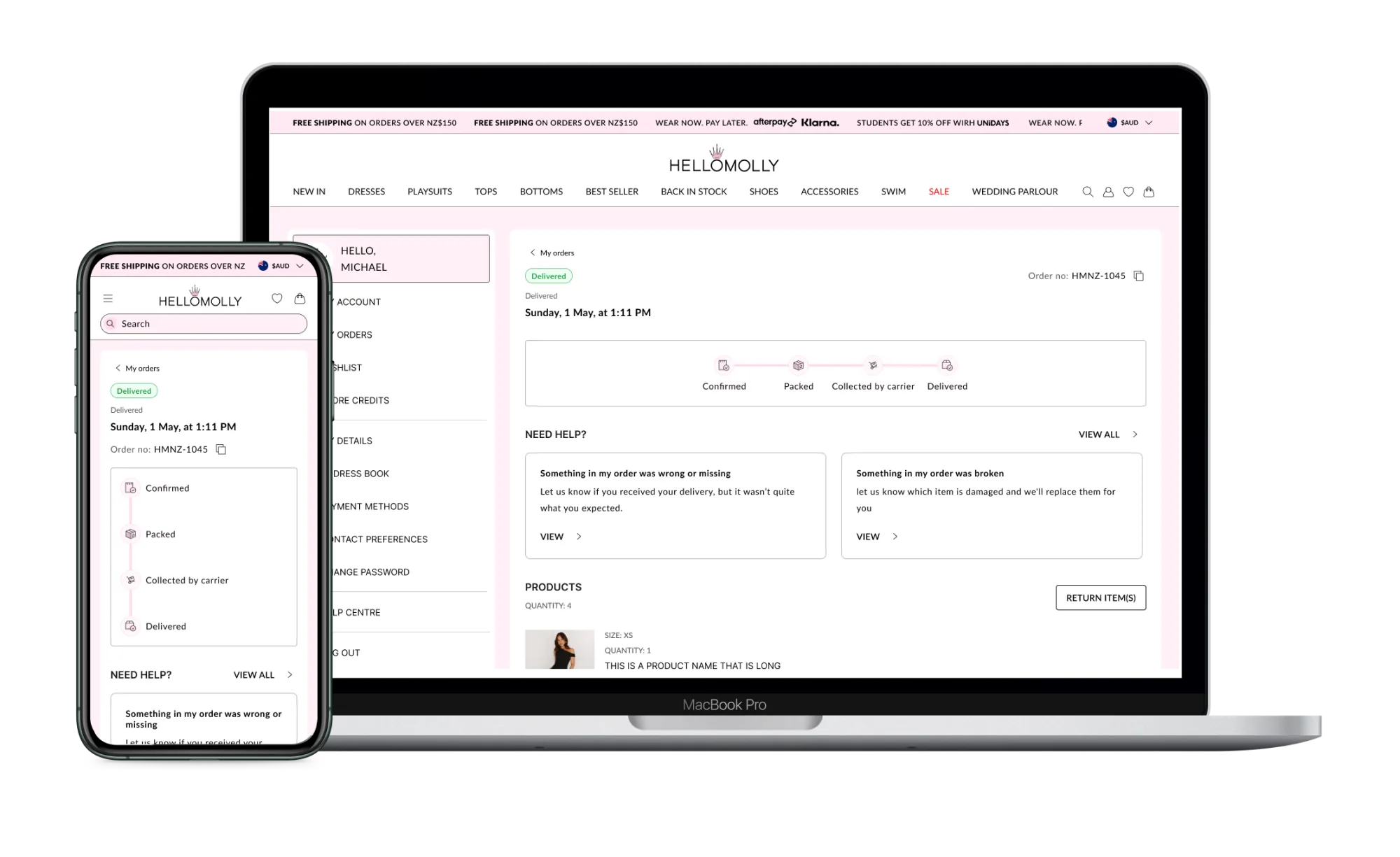
Order details
Users can access essential order information: item details, purchase dates, and order statuses. The information transforms in real time as the order moves through processing, shipment, and delivery. The screen also surfaces relevant modules: need-help, return information.
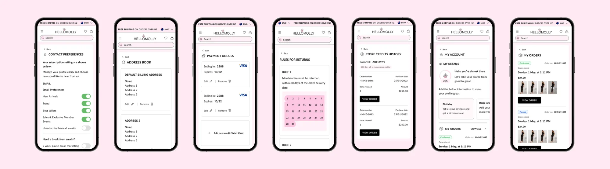
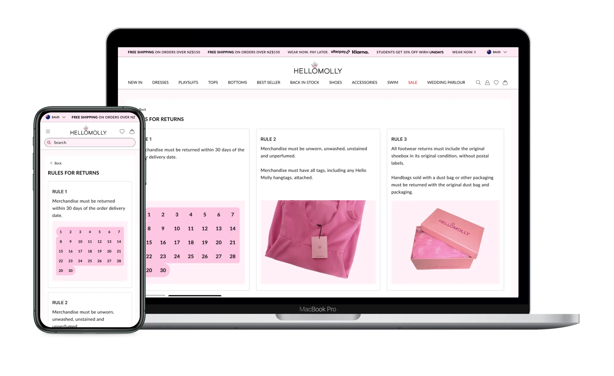
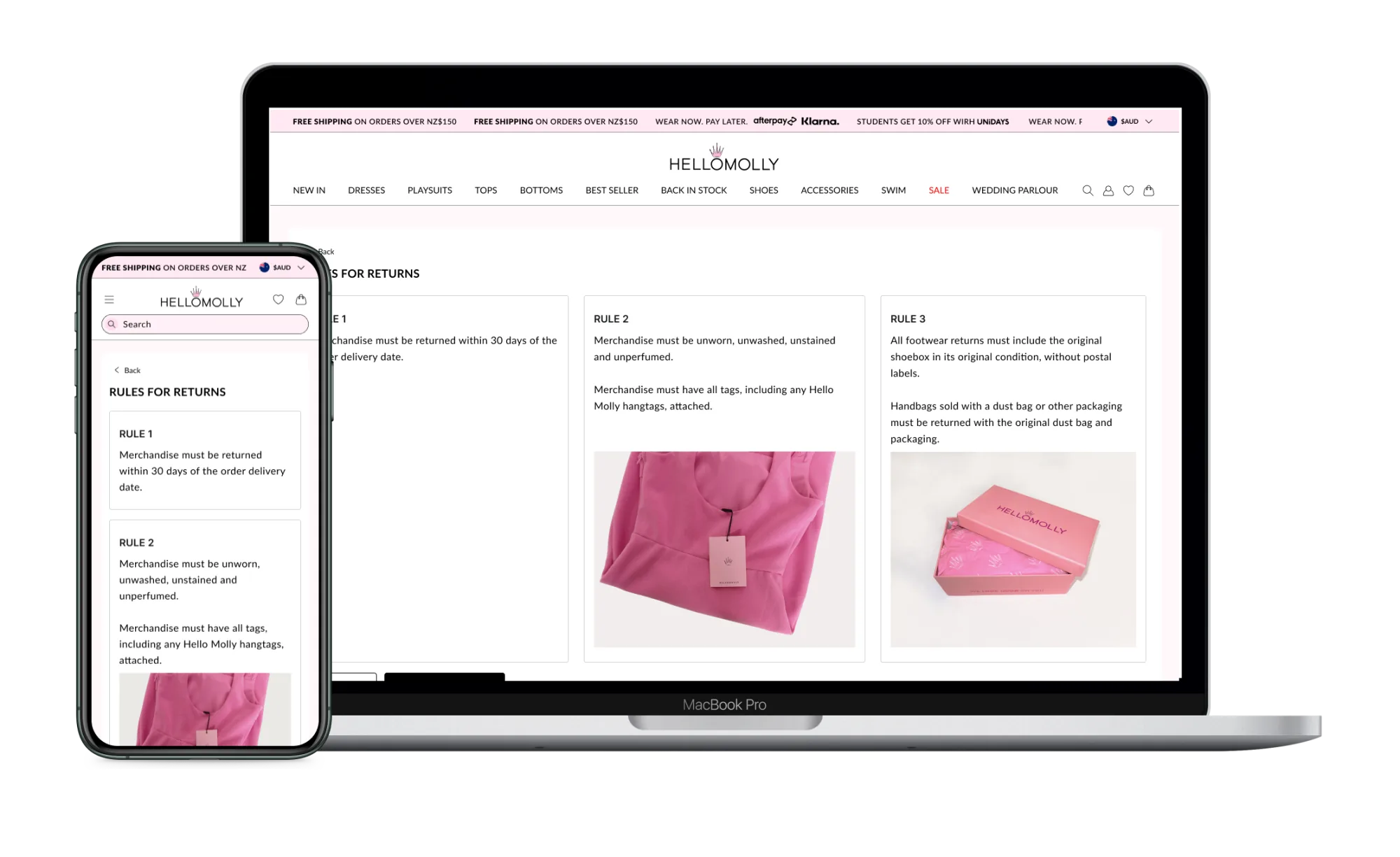
Rules for returns
This page explains the return policy: eligibility, timelines, conditions. The language is plain. Readers understand the rules before they proceed.
Selecting products
Users pick the items they want to return with checkboxes and clear visual cues. The previous flow forced one return per order; this picker lets a customer select items across multiple orders in a single pass, which we then link server-side into one return manifest.
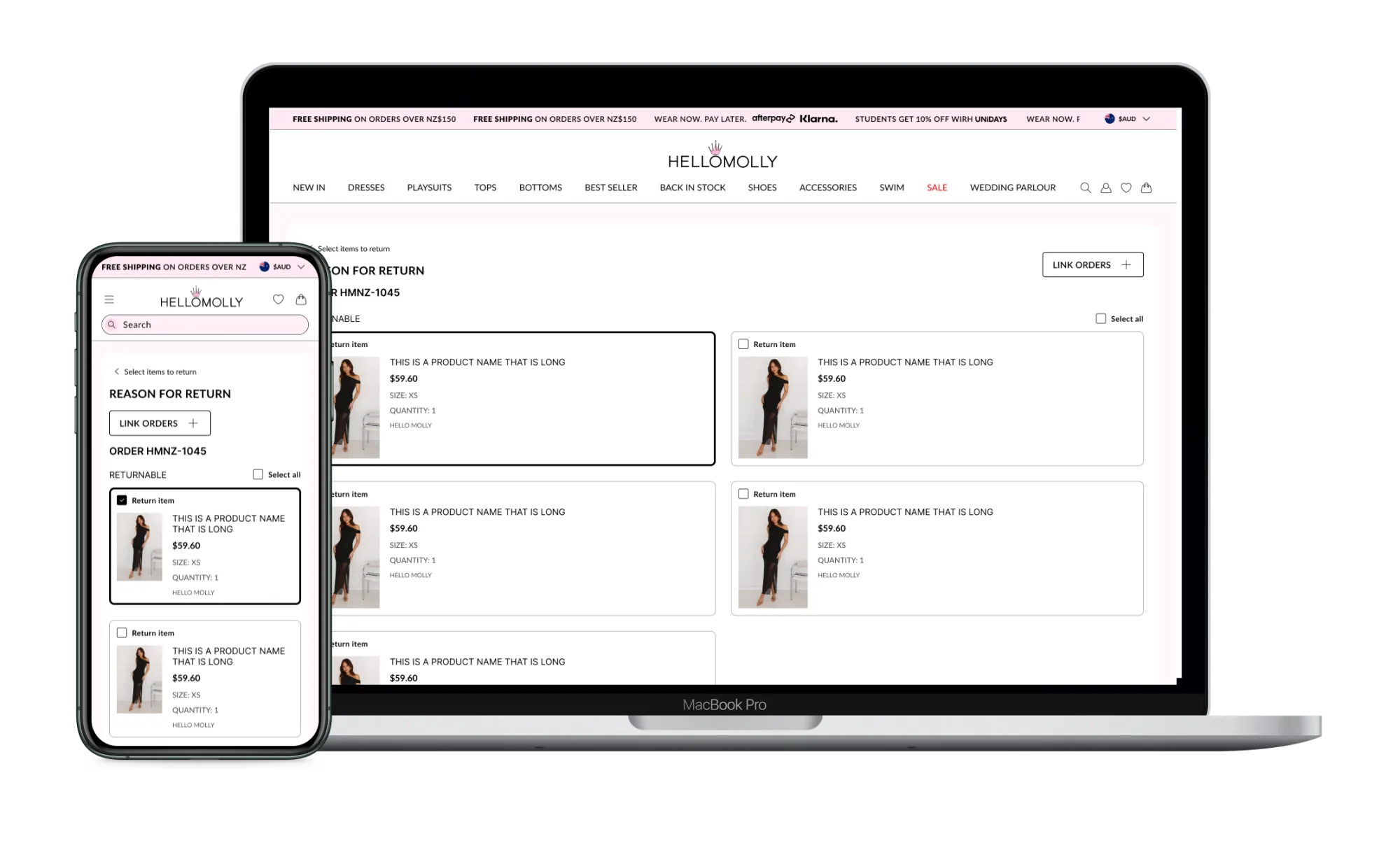
Link orders
For users with multiple orders, this page allows them to link items from different transactions into a single return request. The system prompts on detection of recent linkable orders, removing the most common cause of returns-related support tickets.
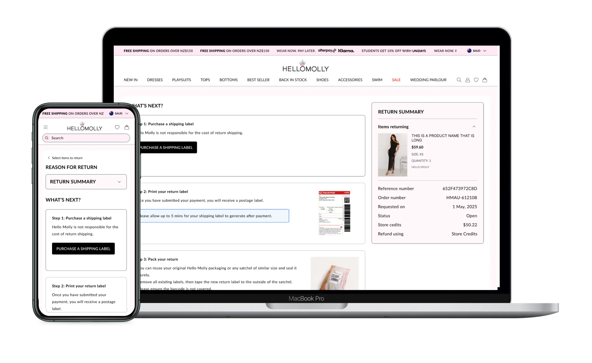
Returns summary
The summary screen recaps everything before the customer commits: items selected, reasons, fees. It uses the same component vocabulary as checkout, so the moment of confirmation feels familiar rather than novel.
Order details: returns
Once a return is submitted, customers see the order details screen update with shipment and refund visibility. State changes as the return moves through processing, return-to-warehouse, and refund, surfacing contextual help only when something has actually gone wrong.