 Michael Papanikolaou
One source of truth for design and engineering.
I built Lessy's design system in Figma in close partnership with one front-end developer, so a brand tweak shipped in a single token edit instead of a global find-and-replace.
Brief
Build a single design language for the Lessy platform so designers and engineers worked from one source of truth. The product was scaling, the team was small, and every new feature was paying a tax in re-drawn buttons, drifting colour values, and hand-off ambiguity. The system needed to remove that tax.
Problem
The same patterns kept being re-invented across screens. Hex values lived inline in components, so a brand tweak meant a global find-and-replace and a long QA tail. Interaction states drifted between surfaces because nothing pulled from a shared role layer. Hand-off relied on screenshots and memory rather than a named library.
My role
As Senior Product Designer, I led the system end-to-end in close partnership with one front-end developer:
- Audit of inconsistencies across the existing UI
- Token architecture: hex, primitive, role layers
- Figma library: foundations, components, variants, states
- Documentation for designers and engineers
- Hand-over and adoption support across two sprint cycles
One source of truth, shipped at speed.
Foundations
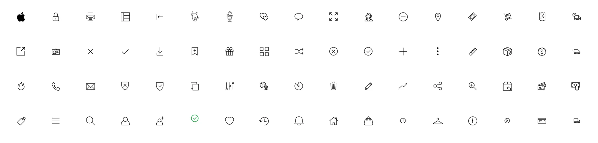
Four foundations carried the system: colour, typography, iconography, spacing. Each was defined once, at primitive and role level, so every screen pulled from the same well instead of redrawing the bucket.
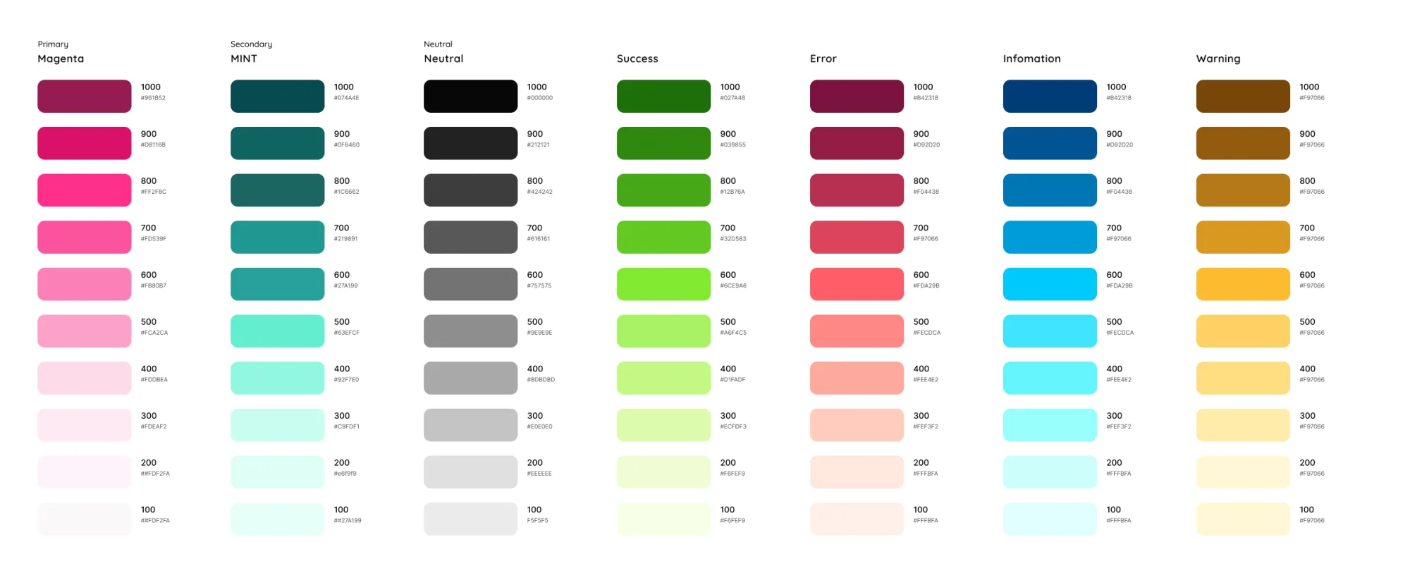
- Colour. A primitive palette wrapped in role tokens, so brand tweaks travelled through the system in one edit.
- Typography. A single scale for headings, body, and captions, so hierarchy read the same on every screen.
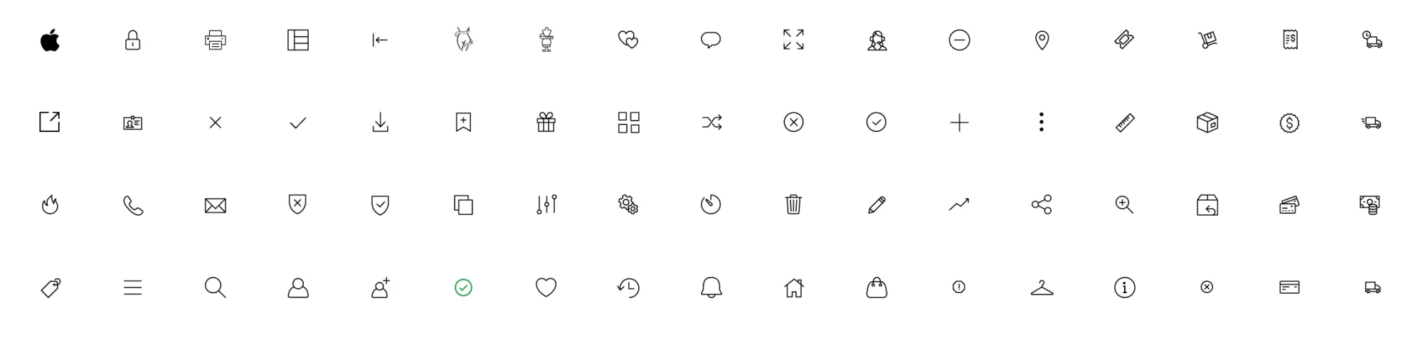
- Iconography. A drawn-from-one-hand icon set, so the visual voice did not break between flows.
- Spacing. Named tokens for layout rhythm, so margins and gutters stopped being decided per-screen.
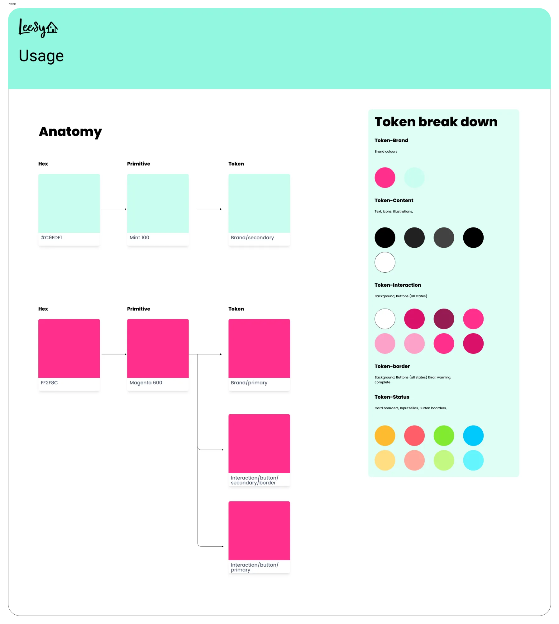
Token architecture
I chose three layers because two would not have been enough. A single hex-to-component cascade meant every brand tweak forced a global find-and-replace; a single primitive layer would have coupled colour intent to colour value. A third role layer broke that coupling: surface, border, interactive, on-surface. Components reference roles, never raw values.
Components reference roles, never raw values.
That single rule was the architectural decision the rest of the system hung off. A brand tweak became a one-line token edit. Interaction states stayed consistent because every component pulled from the same role layer. Engineers stopped chasing colour drift across the codebase.
The cascade
Hex codes sat at the base as raw values. Primitives wrapped them as named variables so a colour could be referred to by name, not number. Role tokens mapped primitives to functional jobs, so a component asked for surface rather than for a specific blue.
Components
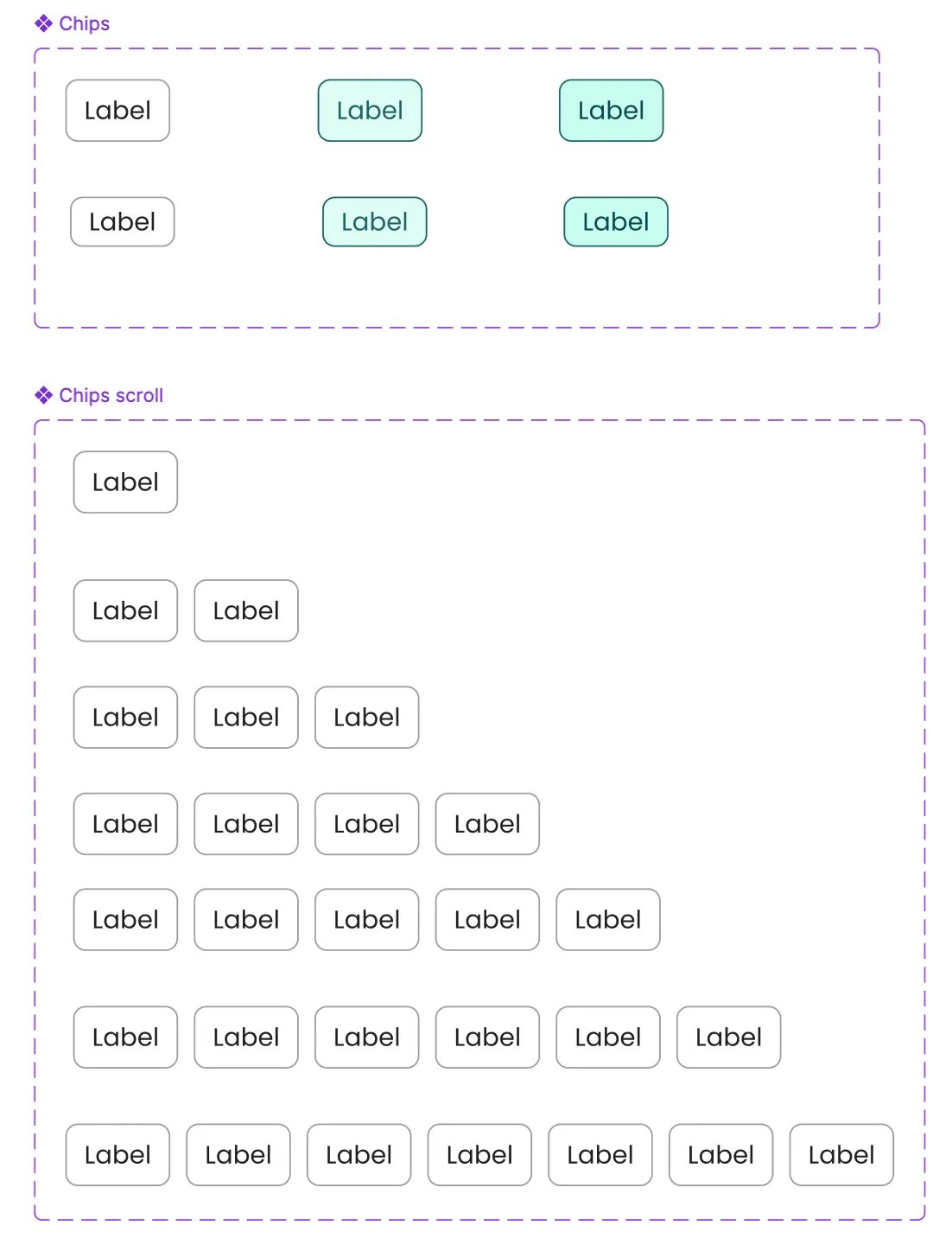
I scoped the library around the patterns the product was already re-inventing: interactive controls, forms, feedback, cards and chips, and navigation. Each pattern was named, drawn once, wired to roles, and given the states it needed.
- Interactive. Buttons, checkboxes, switches.
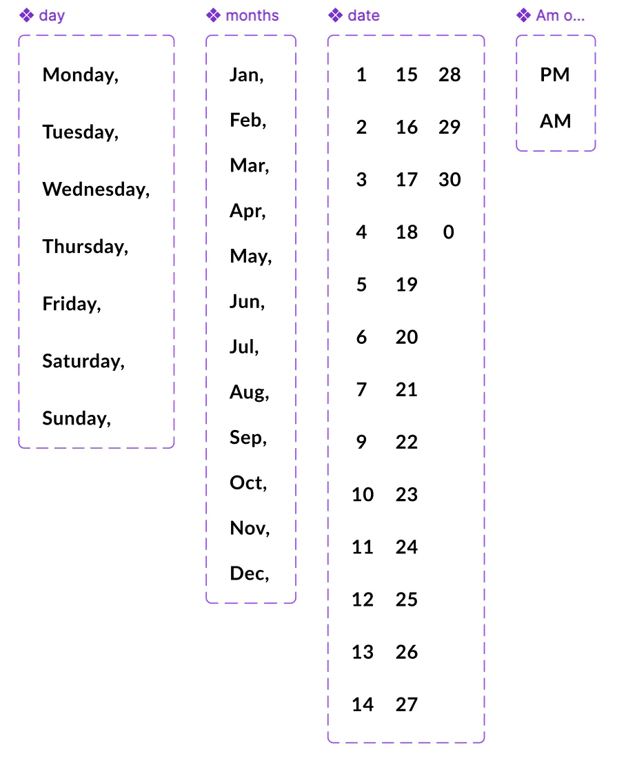
- Forms. Inputs, dropdowns, pickers.
- Feedback. Alerts, badges, banners.
- Containers. Cards and chips for grouping and tagging.
- Navigation. Header and footer patterns that adapted to viewport.
Button language
I froze the variant count at three (primary, secondary, tertiary) and resisted the pressure to add a fourth. A fourth variant would have signalled a missing primitive, not a new pattern. Holding the line forced new asks to compose from existing parts instead of inventing alongside them.
Each variant carried the same anatomy and the same state coverage: disabled, loading, hover, pressed, focus-visible. Engineering implemented one component, designed once, and shipped a whole language.
Adoption
The system shipped into production over two sprint cycles. I tracked front-end build time on equivalent tickets before and after rollout: the same kind of feature, picked up by the same developer, took roughly a third less time to ship once components, tokens, and states pulled from the library instead of being rebuilt per screen.
The headline lift was 30% on front-end build time, but the effect engineering noticed first was quieter: brand tweaks stopped triggering long QA tails, and design hand-offs stopped relying on screenshots.
Where it shipped
The Lessy onboarding and dashboard work that followed in 2023 ran entirely on this system: the same tokens, the same components, the same states. The dashboard composed from the library; it never invented around it. That is the system doing its job.
Methods
How the system came together: a token spine, a Figma library, paired hand-over with engineering, and documentation that lived where the work was being done.