Rebuilding a B2B made-to-measure platform for market lead — and acquisition.
A live garment visualiser, ten render-fallback scenarios, and a phased rollout that protected ~200 daily users at the largest tenant. The surface where tailors meet clients — rebuilt to acquisition grade.
Brief
Taper powers made-to-measure programs for global menswear retailers. The configurator is the sales surface — used by tailors standing next to a client. Leadership wanted an acquisition-grade uplift.
Problem
The flow was dated, dense, and slow at the point of sale. Advisors couldn't show a client what a garment would look like before it shipped — competitors already could. Two needs, one surface: market parity, and acquisition-grade polish.
My role
I led the design-flow rebuild end-to-end:
- Owned the design system for the new flow — 30+ option components
- Designed the ten render-fallback scenarios end-to-end
- Ran the kickoff workshop with engineering and product (FigJam board)
- Designed the phased rollout to protect power users at the largest tenant
- Worked with engineering on render integration and conflict-routing logic
Acquisition-grade investment in the platform's most-used surface.
A deliberate uplift to match the only render-based competitors in B2B made-to-measure. Three tenants — including the largest, ~200 daily users — transitioned without disruption. The work positioned the product for strategic acquisition, and became the foundation later tenants migrated onto.
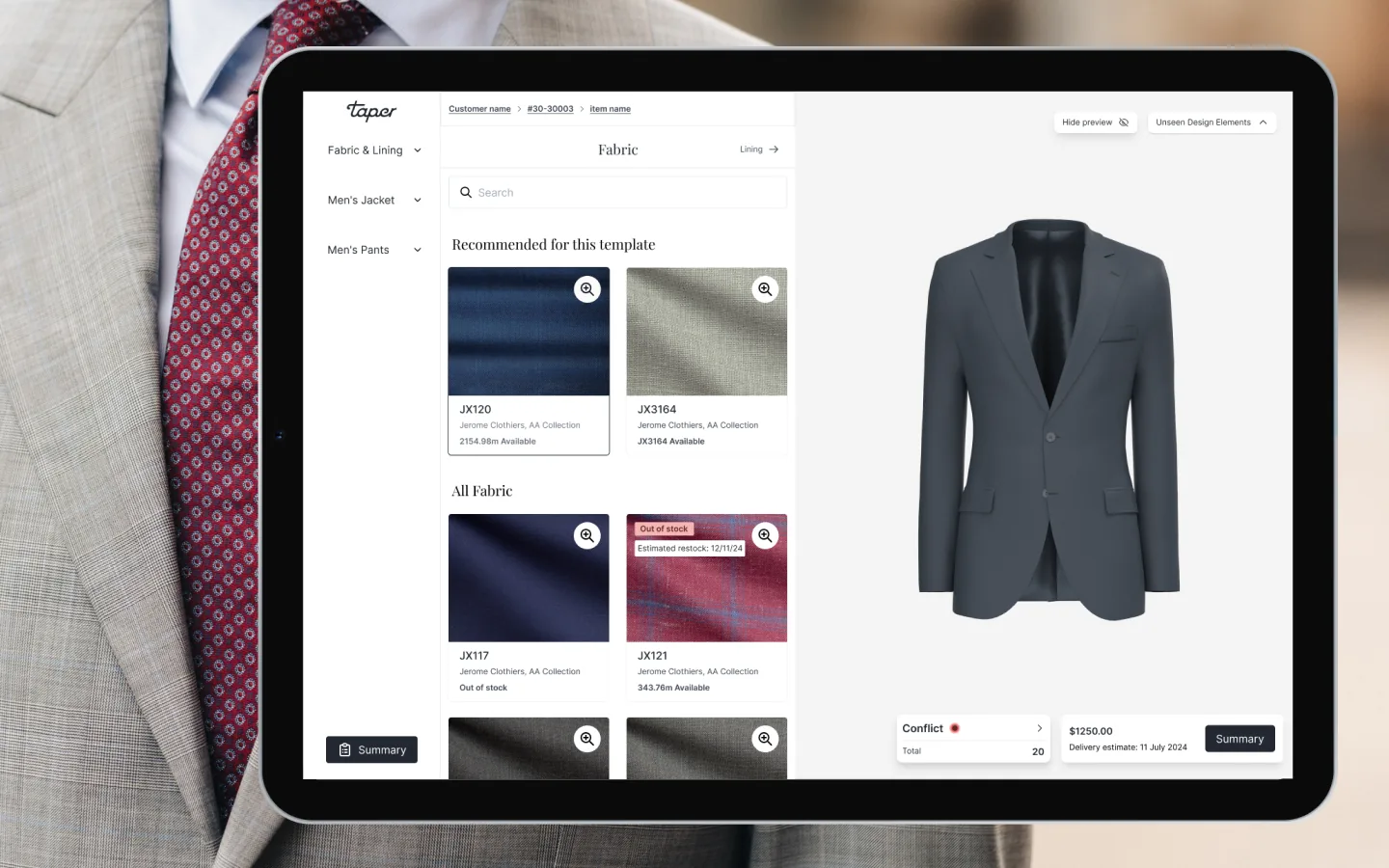
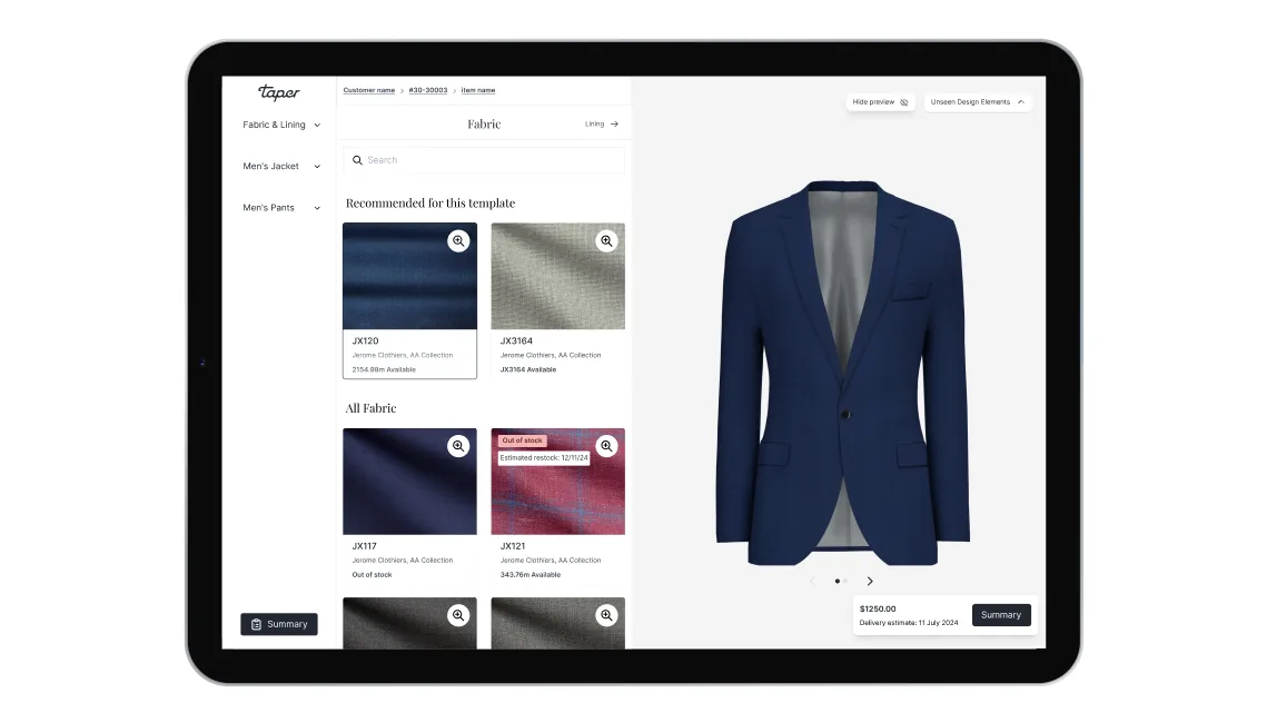
The visualiser
Render on the left, configuration on the right. The garment updates as the advisor changes the lapel, lining, button, fabric. Industry-standard in B2C — new here. Clients see what they're buying before it's made.
Designed for the sales floor
Full-window from the moment an item enters the order — no nav, no admin chrome. Built for desktop and tablet, where tailors actually stand: laptop on the cutting bench, iPad in the showroom. Mobile follows once in-store earns its lift.
Ten fallback scenarios
Most case studies show the happy path; this one had to ship the messy one. Render data is partial across the platform — some tenants have full swatches, some product lines have no renders at all. I designed ten fallback states: split-screen with disclaimer, swatch cards instead of render, default-grey lining, illustration when no render exists. Every state had to feel intentional, not broken.
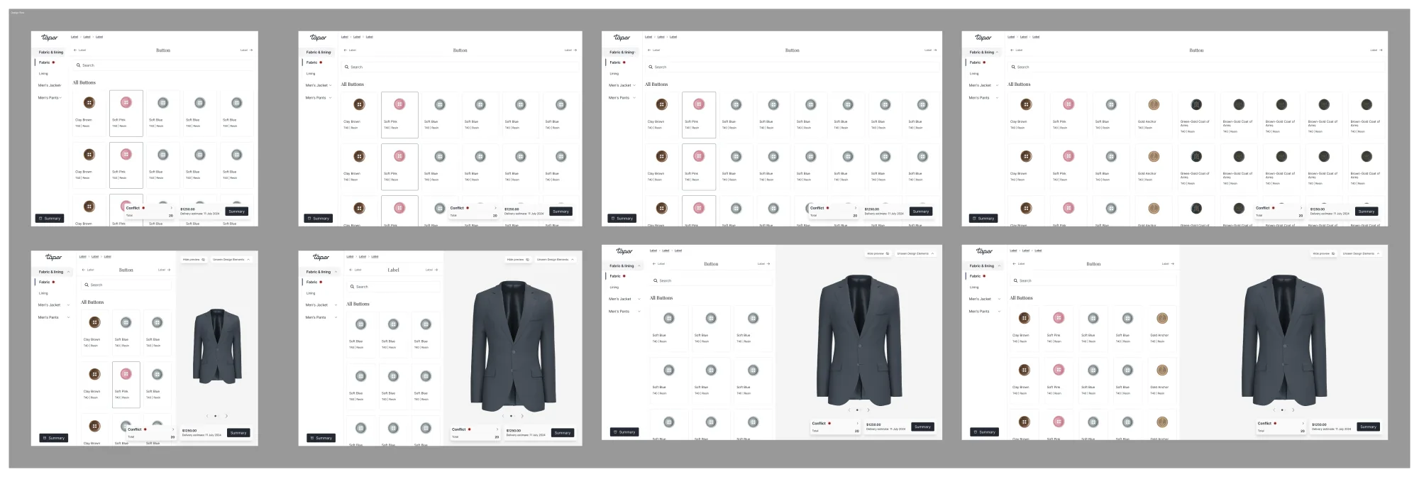
Component system rebuild
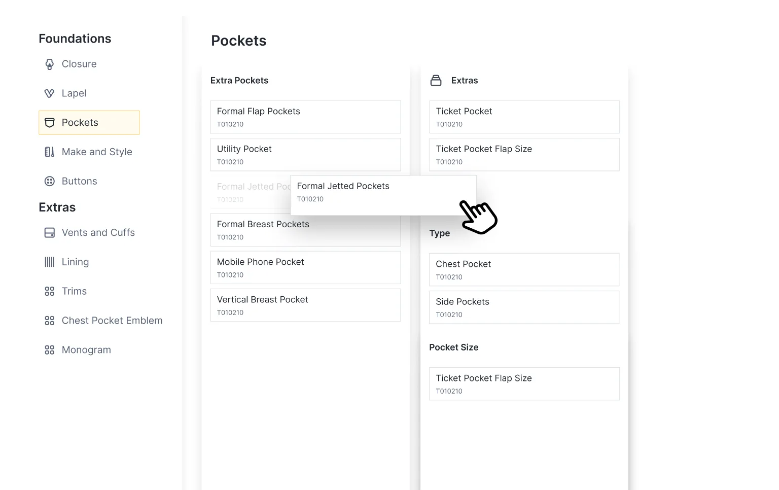
Rebuilt rather than retrofitted: dropdown, radio, grid card, toggle, material card with search, sub-group dividers, top-nav (waist → pocket), left-nav under order items. Aligned to the platform's tokens; documented for hand-off.
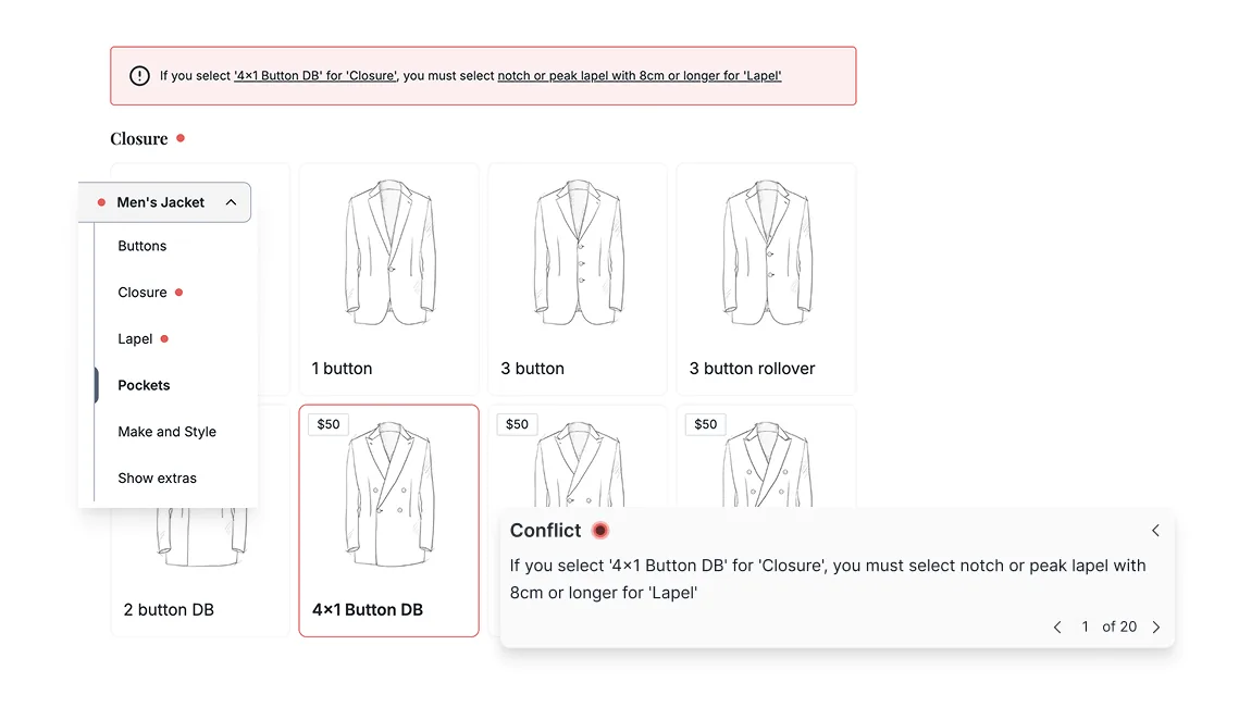
Conflict summary + anchor routing
Conflicts used to surface as scattered alerts. Now they collect at the top of the page; clicking jumps to the section that needs attention. Linter UX, not form validation — fixable in one click.
Apply-to-all
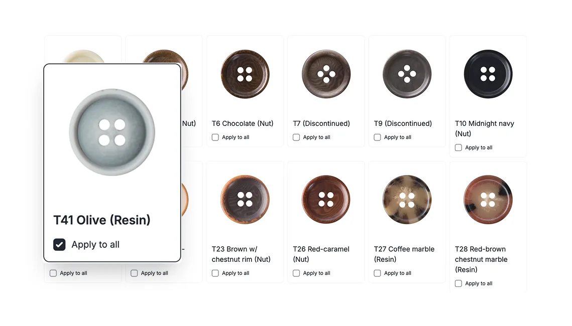
On a 2- or 3-piece suit, the button usually wants to match across all garments. One selection now propagates across the order — dozens of clicks saved, and the most common conflict pre-empted.
Show / hide rendering
The render isn't always wanted on screen — scrolling options, explaining a fit decision, the room sometimes wants quiet. A toggle hides the render and expands the design panel.
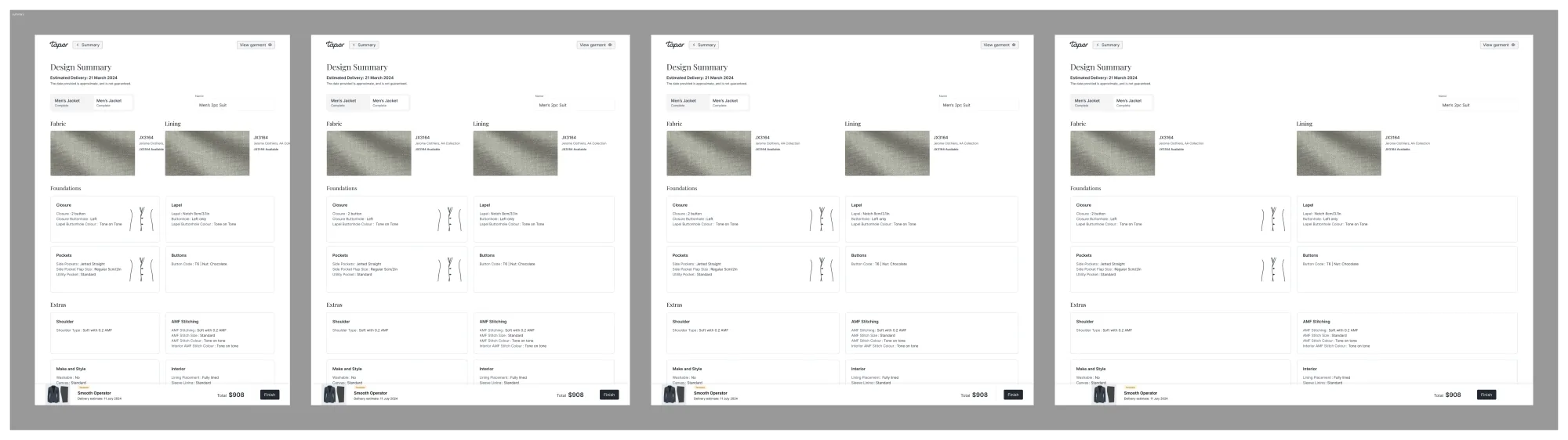
Summary view
Every choice in one place — fabric, lining, design, fit, conflicts, delivery, price. Designed to print clean: the printout is what the client signs off in-store.
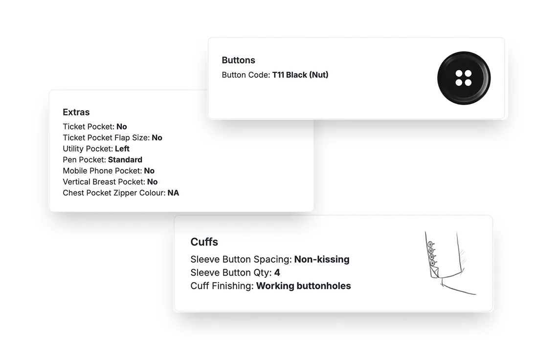
Render details
Zoom into a specific area to inspect the render up close — used to explain a stitch, a closure, a fabric weave without losing the rest of the suit.
Admin configurations
Each tenant configures its own product range, fabrics, linings, and options. Operations can tune the experience per showroom — and add product lines without engineering.
Phased rollout
The launch is part of the case. Three stages, so the biggest tenant could shop the new flow without losing a day of sales-floor productivity.
- Beta — opt-in users; usability and performance signals.
- Opt-in — toggle in settings, new or old flow per session. Protected ~200 power users with muscle memory on the old flow.
- Full transition — once both came back clean, the legacy flow retired.
Slow on purpose. Hard cutover would have broken too many habits at once.
What I learned
The temptation on a market-leading brief is to go big and ship fast. The most valuable decision wasn't the render — it was the rollout. Designing for the transition, not just the destination, is what made this acquisition-grade. Power users don't reward novelty; they reward continuity.