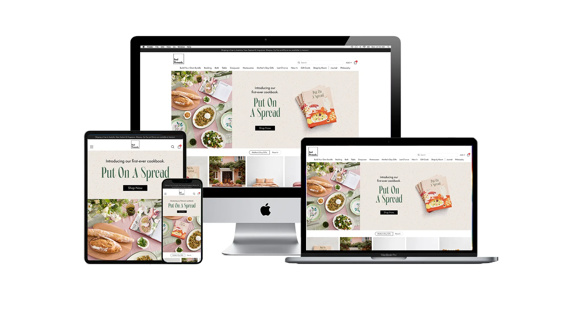
Homepage.
A homepage that answers the three questions any homepage must answer, who, what, and why here, in the first three seconds. Mobile-first, editorial entry point for the brand.
Brief
Redesign the Bed Threads homepage end-to-end. Use research, testing, and best practice to drive ideation and the final design.
Problem
The existing homepage didn't earn the first three seconds. It didn't say who Bed Threads is, what it sells, or what to do next. And 75%+ of visitors were arriving on a phone where the layout couldn't keep up.
My role
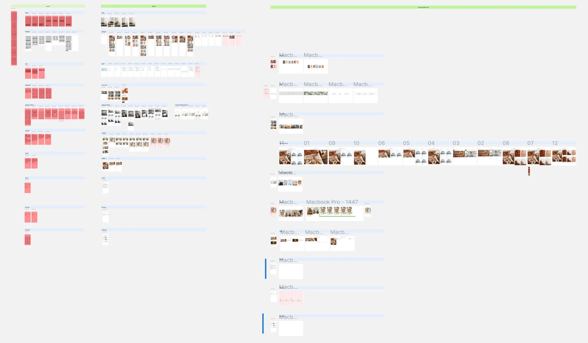
End-to-end on the homepage:
- Synthesised research across mobile usage and homepage best practice
- Ran a stakeholder workshop and competitor analysis
- Ideated and refined the homepage across mobile and desktop
- Final design and developer hand-off
Synthesised research
- 75%+ of visitors are on a phone.
- 3 seconds to tell a visitor who you are, what you do, and why they're here.
- 38% disengage if the content and layout don't earn it.
- The homepage wears many hats. It serves different audiences arriving from different origins, not one landing page built around one action.
- Identity matters. Make the first interaction feel personable.
Workshop
Reviewed research and findings with the team. Stakeholders each brought two competitors so we could analyse them together for areas of opportunity.
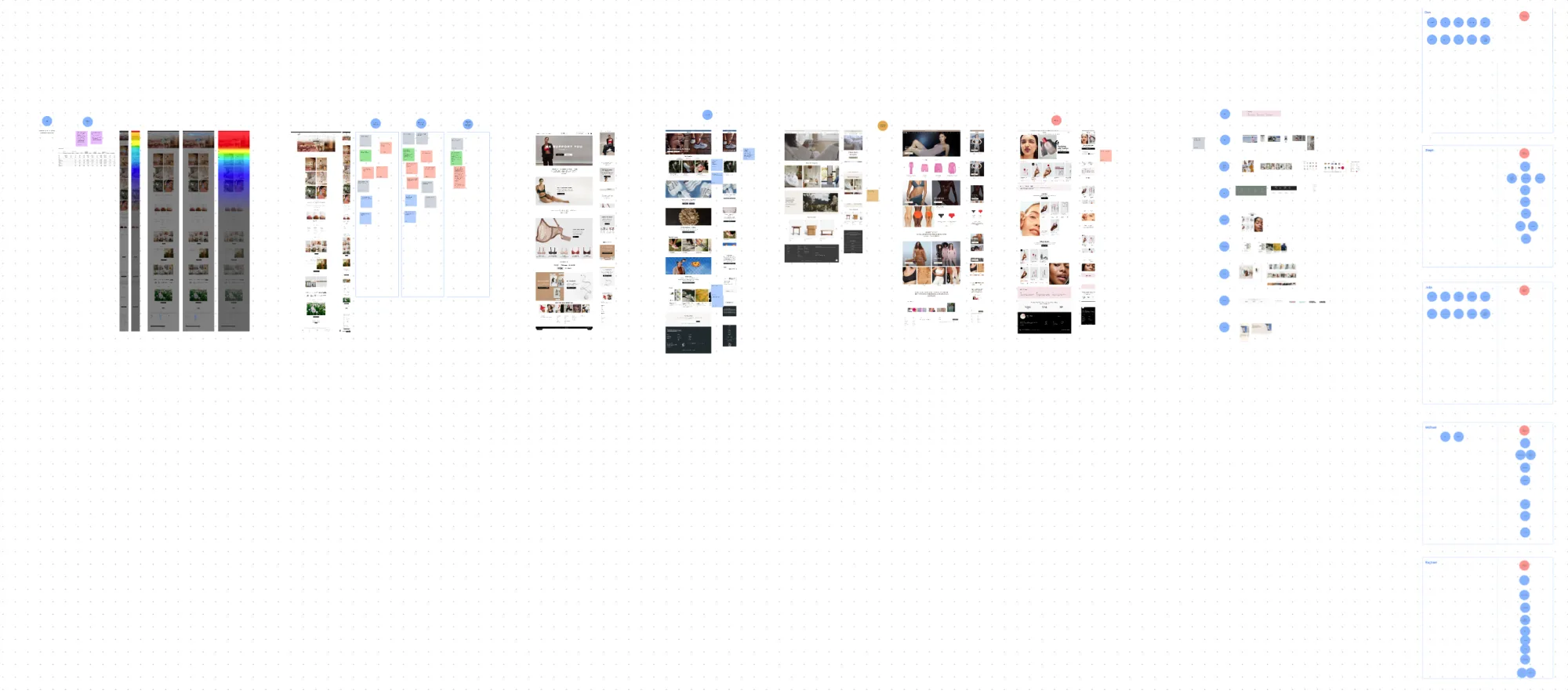
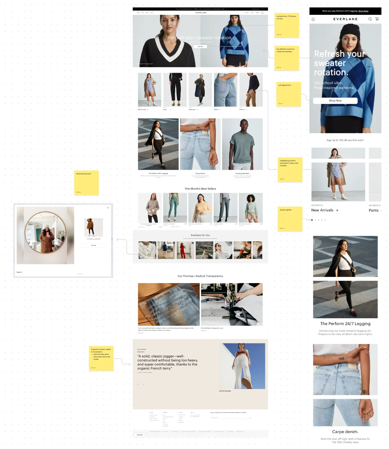
Competitor analysis
Two competitors per stakeholder, mapped against the three-second rule and mobile experience.
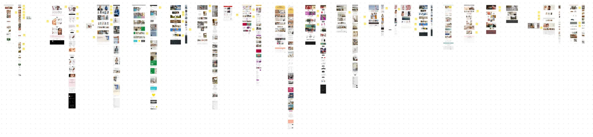
Ideations
Early structural explorations: what earns the first scroll, what the hero needs to do, where editorial sits.
Refined directions
Two directions taken further: one editorial, one product-led. Both compared on how they handle the three-second rule on mobile.
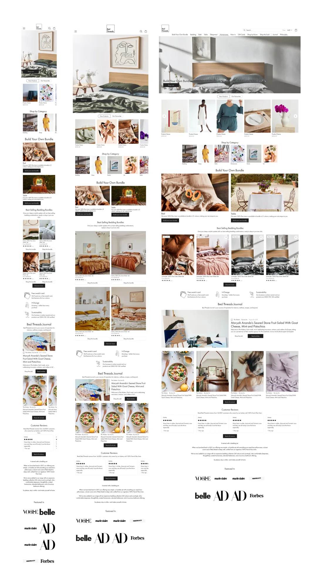
Final design
Editorial entry point. Mobile-first. Who, what, and why here, answered above the fold.