Order tracking that customers actually trust.
Redesigned BWS's native-app order status experience, including the unhappy paths most apps skip over. The result tells customers what's happening, when, and what to do if it isn't.
Brief
Lift visibility of order-status updates and carrier delivery updates inside the BWS native app. The order-tracking squad surfaces these updates; UI/UX translates them into customer-friendly language. The redesign needed to communicate clearly when things go right, and especially when they don't.
Problem
The existing flow handled the happy path well but obscured failure states. When deliveries were delayed, customers were left without clear next steps. ETAs were under-emphasised relative to what customers actually cared about, and unhappy-path scenarios were undifferentiated from successful ones. That left support tickets as the only path to resolution.
My role
As Senior UI Designer for the order-tracking squad, I led the experience end-to-end:
- Audit of the original flow against support-ticket categories
- Three rounds of testing at low / mid / high fidelity
- Status-tag taxonomy and visual exploration
- End-to-end design: wireframes, low-fi to mid/hi-fi, interaction
- Alignment with the new BWS brand and design system
- Dev hand-off and QA
Ideation
Multiple ideation rounds across the high-traffic surfaces: list view, detail view, and the progress timeline. The goal was to test how status, ETA, and contextual actions could fit together without crowding any single screen.
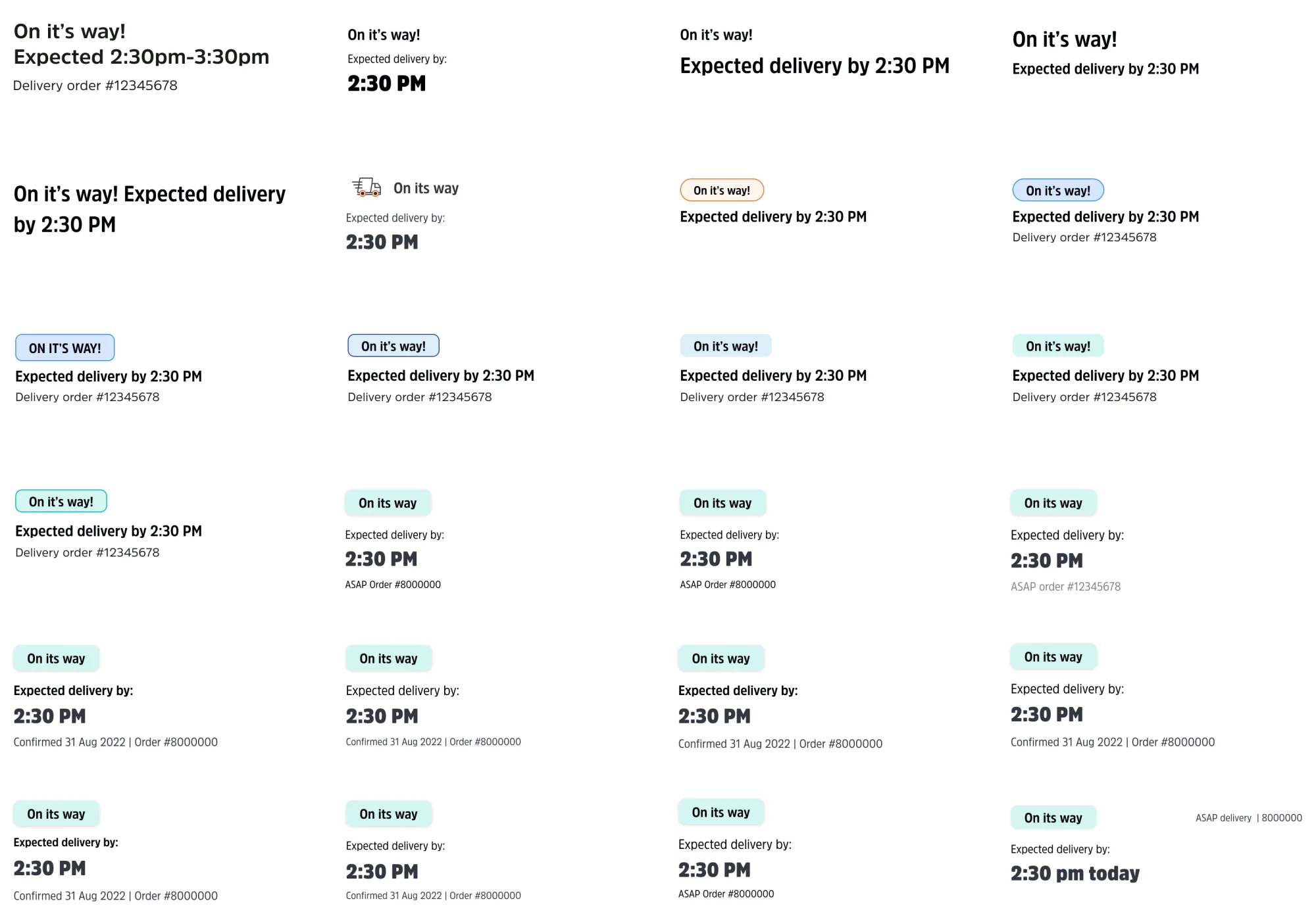
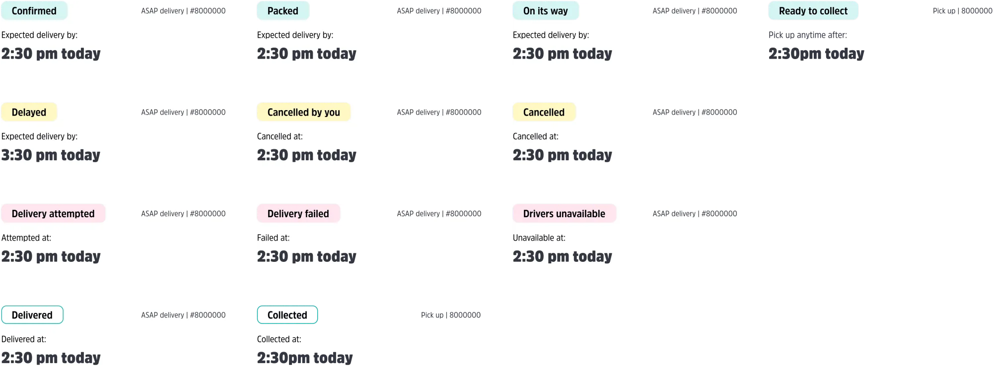
Status tags
A small system that does a lot of work. Each tag carries a colour, an icon, and a copy pattern that maps to one of six unhappy-path scenarios surfaced during research. The same tags ship into the BWS bot and the SMS channel for consistency across surfaces.
Testing
Three rounds at low, mid, and high fidelity. Each round was scoped to validate or invalidate one specific assumption about how customers read order status, and each one re-shaped what I shipped into the next round.
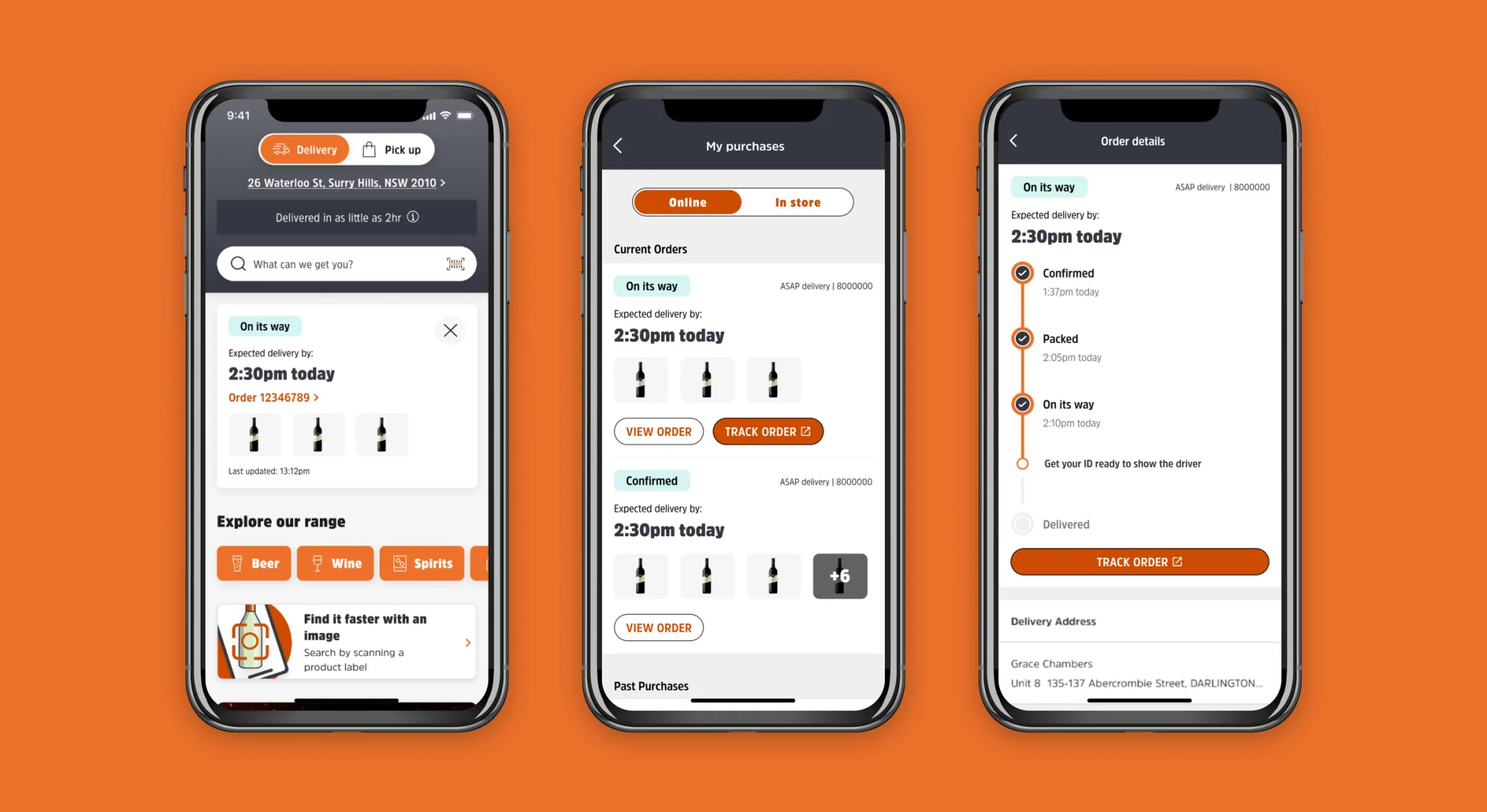
Final designs
A redesigned order-tracking experience across My purchases and Order details, with a unified status-tag system, clearer ETAs, and explicit pathways to manage orders when something needs attention.
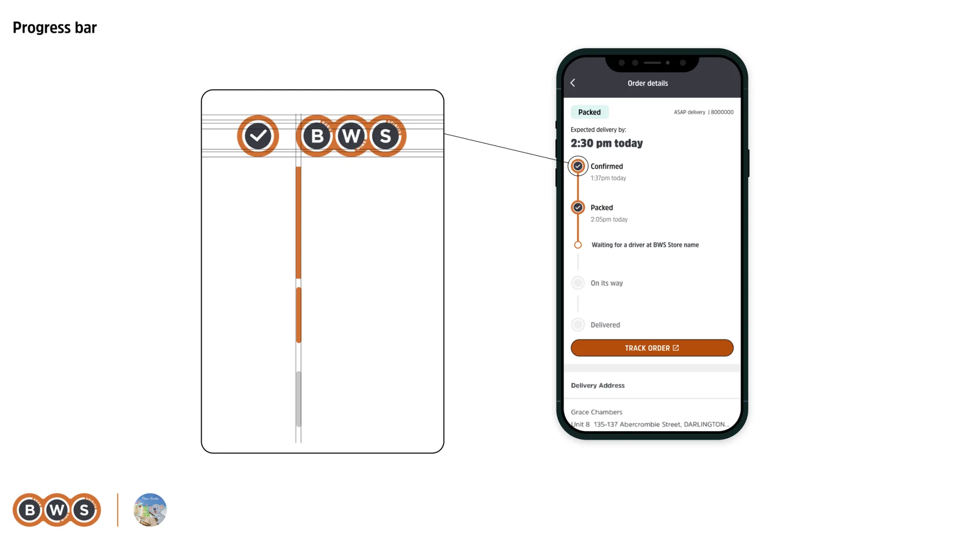
Progress bar
Three states the original timeline didn't differentiate (confirmed, packed, on-its-way) now each have their own moment in the bar with clear visual progression. Failure states slot in as a deliberate fourth visual register, not a buried error message.
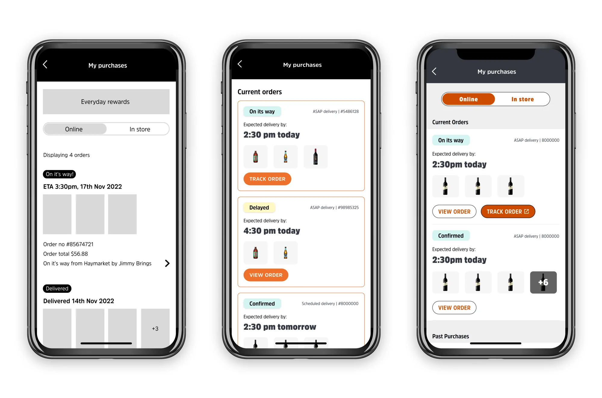
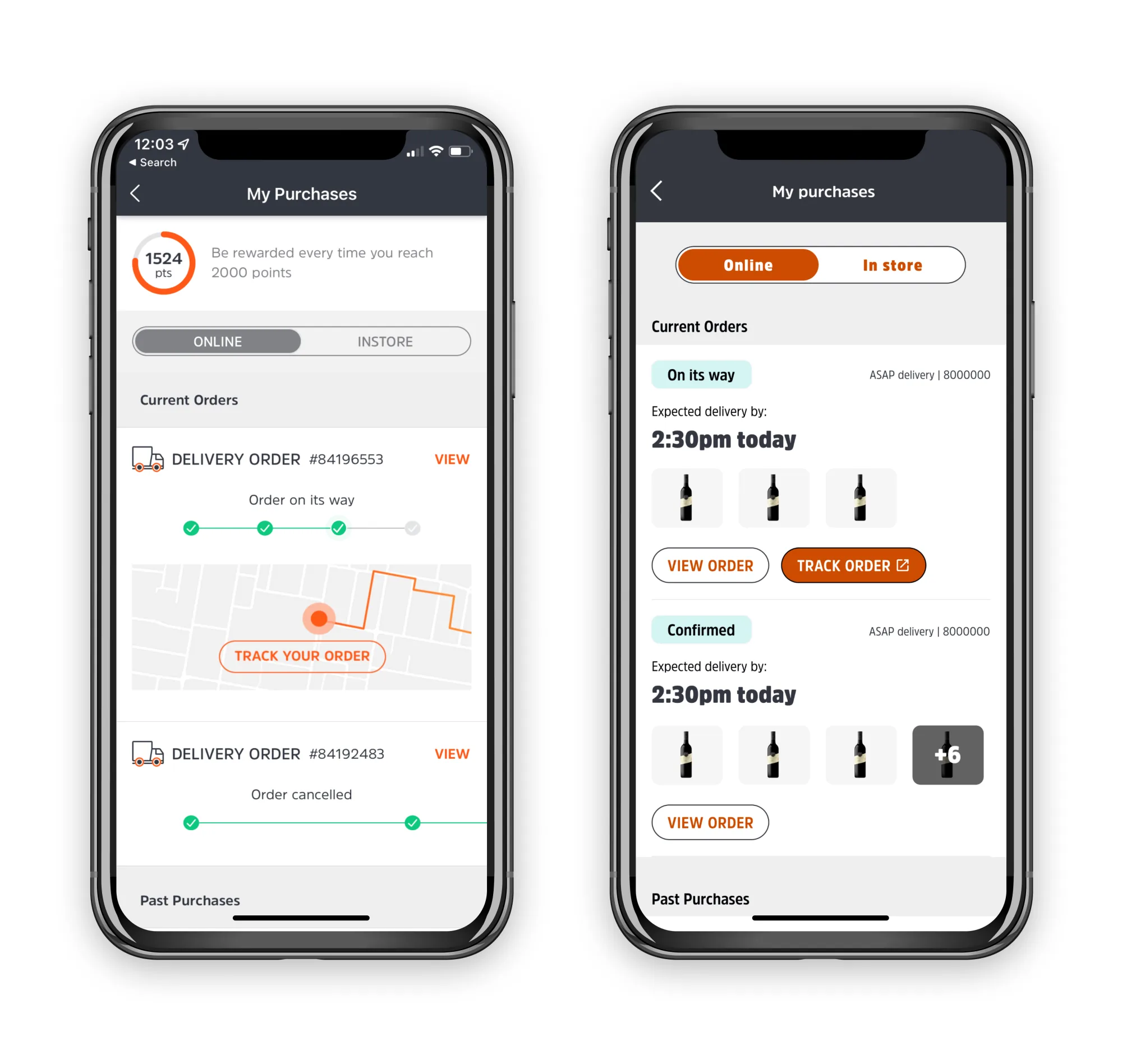
My purchases
The same list, side by side. On the left, the original tiles lead with a status string and an embedded map — the customer learns where the truck is before they learn when it'll arrive. On the right, each order leads with a status tag, the ETA, and the items inside, with view and track surfaced as separate actions. Status tags carry colour and language from the new BWS brand system.
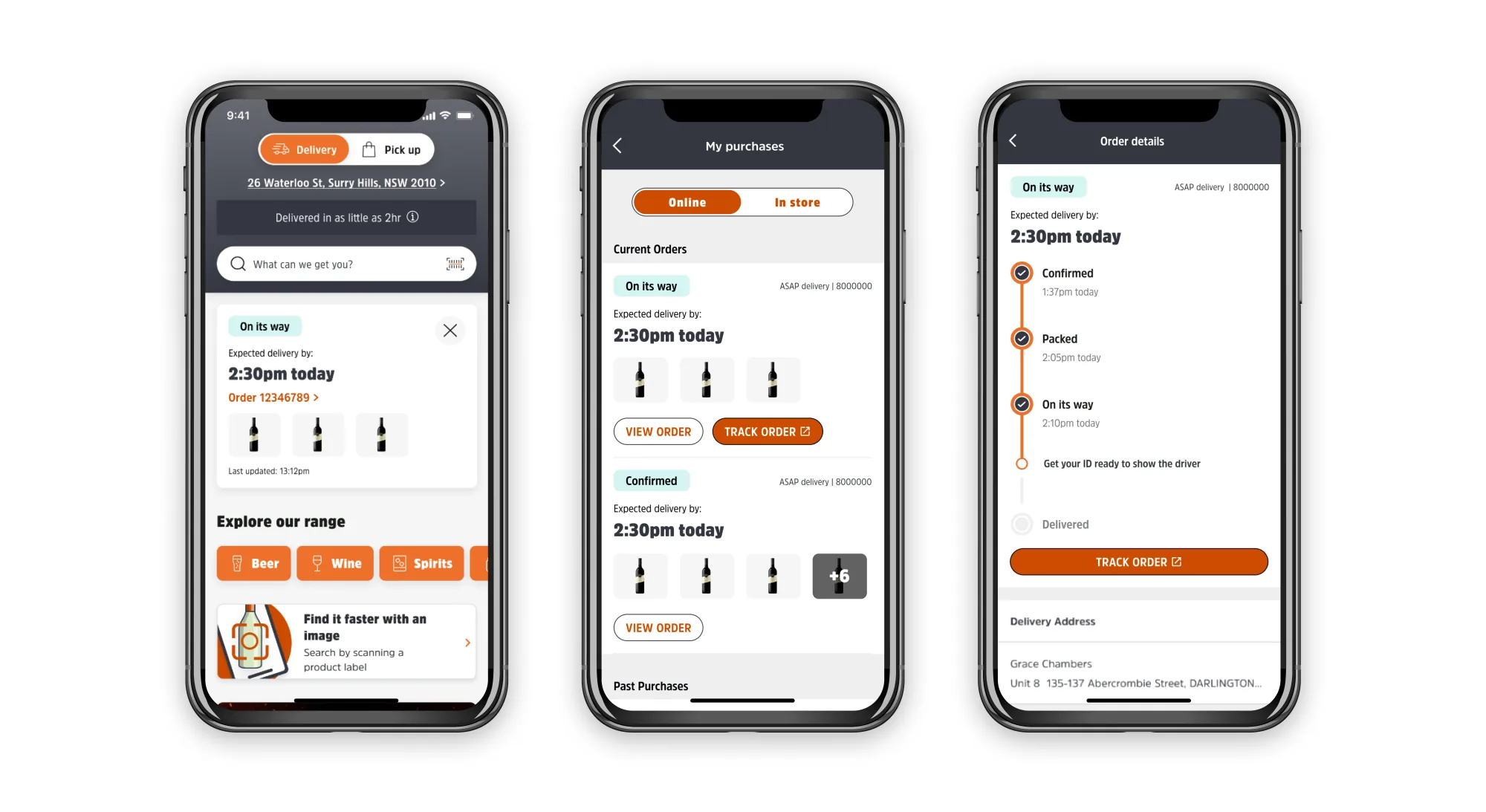
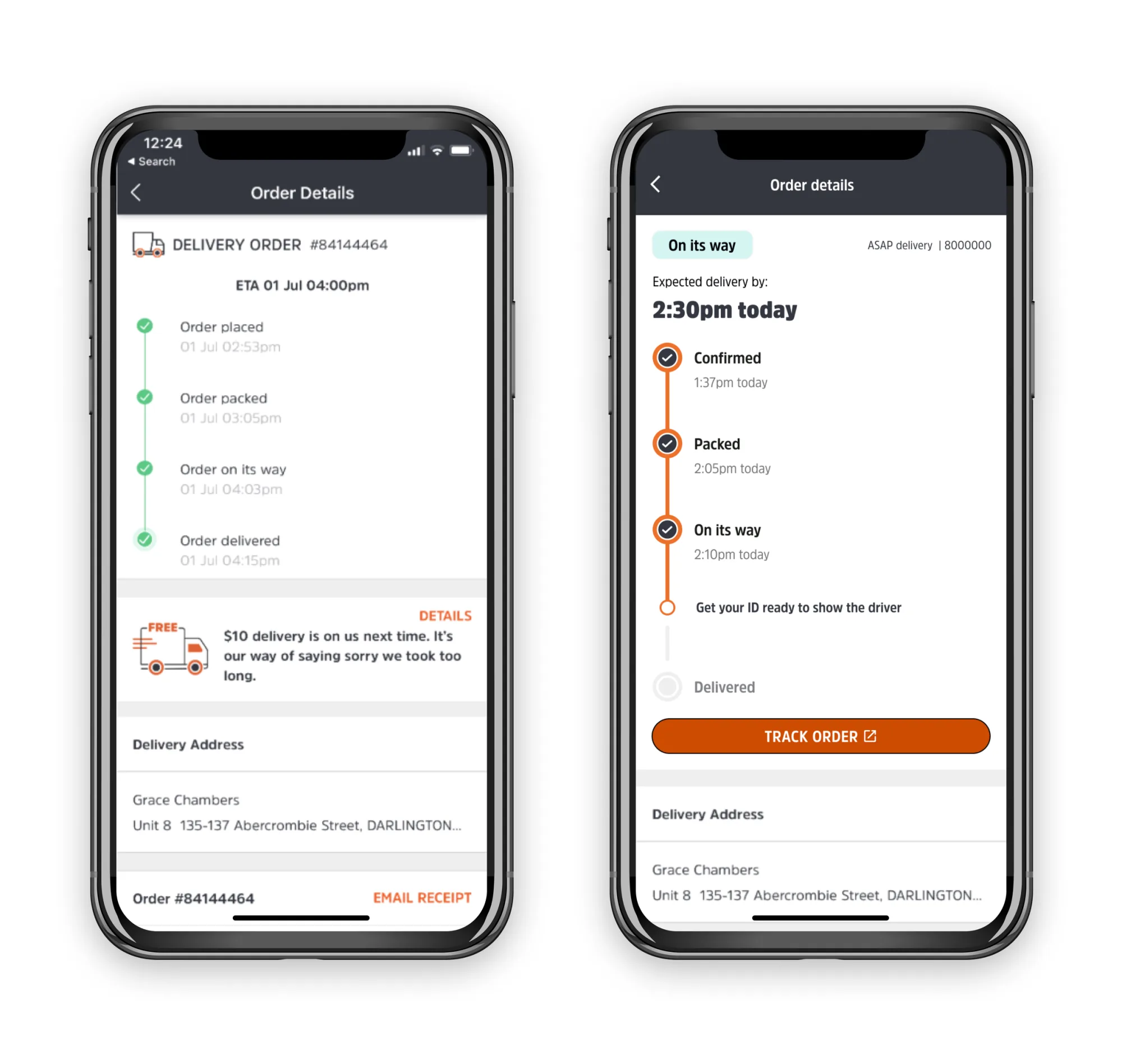
Order details
The same delivery, side by side. On the left, the original detail view — a passive log of timestamps where the ETA sits in plain text and every past event carries equal weight. On the right, the redesign leads with status, delivery time, and the next action the customer needs to take. The progress bar reuses the same status taxonomy as the list view, so language stays consistent across the journey.
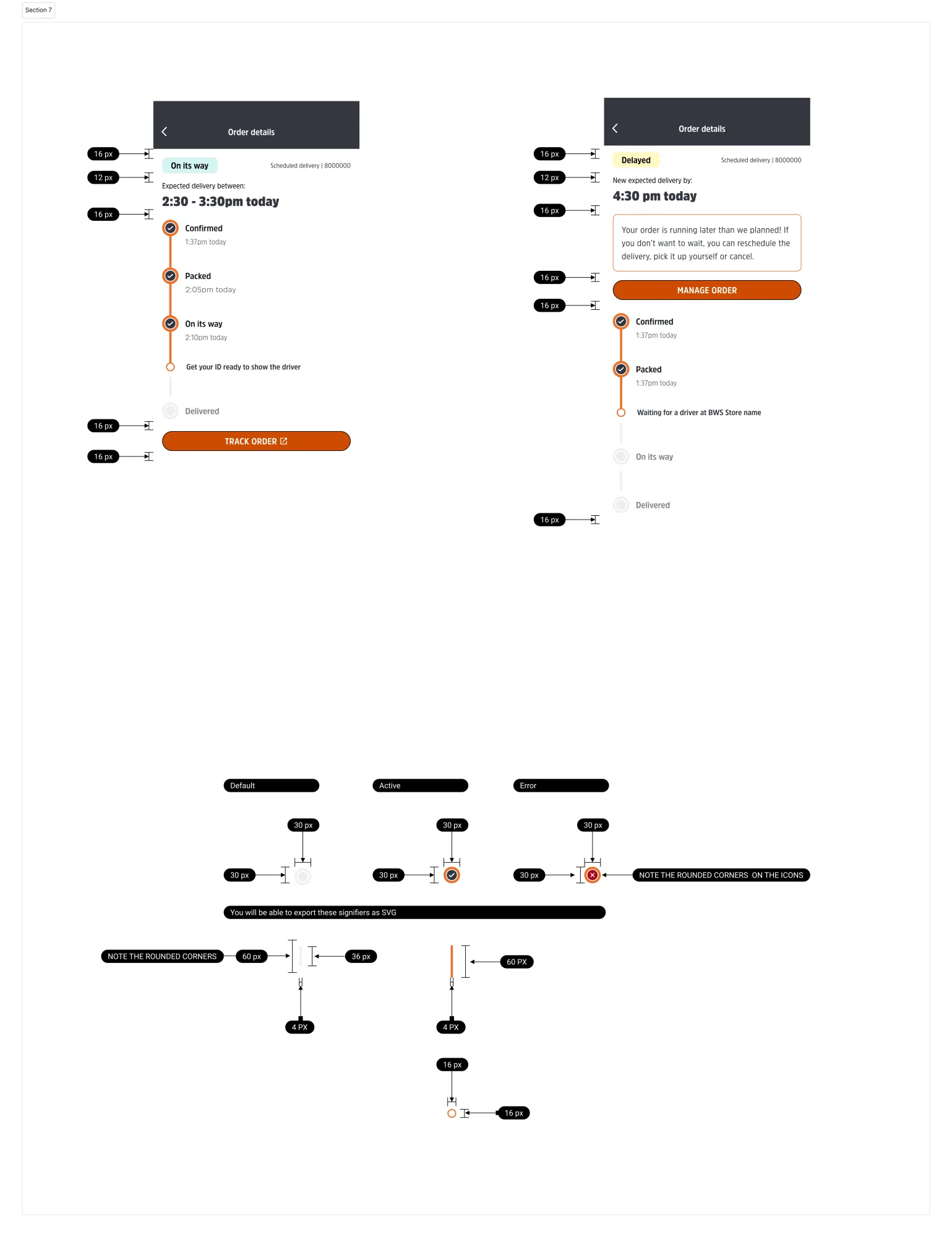
Dev notes & hand-off
Annotated specs covering interaction states, animation timing, and the conditional logic between API status responses and customer-facing tags. The hand-off doc became the squad's source of truth for both engineering and the support team writing the back-end status copy.