

.jpg)
.jpg)
NO.7 WATER JUG
THE NO.7 WATER JUG IS DESIGNED AROUND THE IDEALS OF MINIMALISM. BY CREATING A ROUNDED BOTTOM OF THE JUG IT ALLOWS FOR AN UNCLUTTERED DINING TABLE, FORCING THE USER TO PLACE IT BACK INTO ITS HOUSING.
NO.7 WATER JUG
THE NO.7 WATER JUG IS DESIGNED AROUND THE IDEALS OF MINIMALISM. BY CREATING A ROUNDED BOTTOM OF THE JUG IT ALLOWS FOR AN UNCLUTTERED DINING TABLE, FORCING THE USER TO PLACE IT BACK INTO ITS HOUSING.
Bed Threads Product Page

Brief
The brief was to work from end to end to redesign the Bed Threads product page utilising various forms of research, testing, methodologies and best practices to help drive the Ideation and design.
Competitor analysis


-
Square PDP image brings more content higher up in page fold.
-
Small breadcrumb allows for context & navigation
-
Very minimal product copy
-
Even as the exclusive BNPL, Afterpay messaging does not feature prominently on the page. It’s quite a subdued callout
-
‘Buy it now' button links directly into Checkout 'Info’ page one.
-
Only offer one BNPL (affirm)
-
PDP image are landscape
-
Dedicated reviews page
-
On page Linen education supported with video asset
-
NEW callout about colour swatches
-
Use secondary and tertiary background colours to create hierarchy and break up the page
-
“On-page” bundling. Has options for duvet insert/ pillow


-
Image with dimensions is featured in the gallery.
-
Sophisticated image gallery with 360º and VR feature
-
Order Swatch CTA
-
Detailed product specifications
-
Promotes styling advice as well as CS. CS agents are referred to as “stylists”
-
USP call out
-
Commonly asked questions on the PDP
-
Less focus on reviews
-
Mobile sticky add to cart is at the top of the page - is this to stay out of the viewport/ focus of the user?
HotJar Insights (original design)
Heatmaps
-
Only 97% users scrolled below the fold, 75% scrolled to the swatches and only 50% of users scrolled past the size selector.
-
Most interacted with elements are the colour swatches (approx 60% of all on page taps), lifestyle image (14% of taps), “Read More” link (5%), Reviews <1%. This doesn’t include the sticky add to cart
Observed behaviour from session recordings:
-
A few users oscillated between BYOB and Bedding Sets. They had added a BYOB bundle added to their cart, had their cart open and were referencing the Bedding Set Page and click between swatches.
-
A few users tired to click the thumbnail item in checkout thinking that it is linked.
-
One user looked “confused”, cursor hovered over Bedding Sets, then Sheet Sets and back to bedding sets a few times. It seemed like they didn’t know which one to click.
Synthesised product page research
Product images
-
“In a February 2018 survey from Salsify, 60% of US digital shoppers said they needed to see an average of three or four images when shopping online. And another 13% said they needed five or more.“ Source link here
-
"Add context to your product. Merchandise shown in context are more memorable and will give a sense of how it will look like in the real world. Don’t sell your product. Sell the experience that your product offers." Source link here
Reviews
-
“according to bright local consumer review survey 2015. “ 90% of 18- 34 year old consumers trust online reviews as much as personal recommendations”
-
"According to a study, 68% of consumers said that they are inclined to trust more when there are both bad and good reviews. 30% of consumers suspect inauthenticity when they don’t see anything negative." Source link here
User
-
"79 per cent of our test users always scanned any new page they came across; only 16 per cent read word-by-word." Source link here
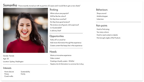
Personas
%201.png)
%201.png)
Card sorting workshop
Conducting several workshops, including and yet not limited to stakeholder requirements, research and ideation sessions.


Ideation Infomation architecture - Low Fidelity
I started ideating the overall structure of the page leveraging all of the research above.
.jpg)
.jpg)
.jpg)
.jpg)
.jpg)
Features - Low Fidelity ideation
After the overall structure was mapped out, I pulled out the 12 bespoke components and ideated them out individually.
.jpg)
.jpg)
.jpg)
.jpg)
.jpg)
.jpg)
.jpg)
.jpg)
Mid fidelity features Ideation
After ideation of the features in Low fidelity, I then took the designs into Figma and ideated them out in mid/high fidelity. I like to ideate in this fidelity as it allows me to understand the overall experience and how the UI reflects the branding. As a designer ideation is my most powerful tool.

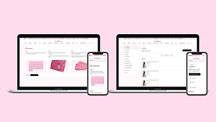
Sticky add to cart - Mid/high fidelity ideation
.png)
Methodologies
Throughout my practice, I leverage various methodologies allowing me to validate or in invalidate my ideas, doing this allows me to remove my bias and create features that are usable for the user.
In this case, I leverage mobile usability methodologies to increase the usability of the size select feature. Placing the pushing popup at the bottom of the viewport, it allows for greater usability for this feature. When you make an experience usable, you are on your way to designing and developing a product that meets all the requirements and adds value to the users life

.png)
Dev Hand over notes


.png)


.png)
.png)


.png)