

.jpg)
.jpg)
NO.7 WATER JUG
THE NO.7 WATER JUG IS DESIGNED AROUND THE IDEALS OF MINIMALISM. BY CREATING A ROUNDED BOTTOM OF THE JUG IT ALLOWS FOR AN UNCLUTTERED DINING TABLE, FORCING THE USER TO PLACE IT BACK INTO ITS HOUSING.
NO.7 WATER JUG
THE NO.7 WATER JUG IS DESIGNED AROUND THE IDEALS OF MINIMALISM. BY CREATING A ROUNDED BOTTOM OF THE JUG IT ALLOWS FOR AN UNCLUTTERED DINING TABLE, FORCING THE USER TO PLACE IT BACK INTO ITS HOUSING.
Jimmy Brings
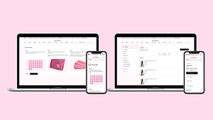
Original
.png)
Redesign
.png)
Brief
The client, Jimmy Brings, required an innovative solution to their e-commerce app. The design I developed was influenced by various quantitative and qualitative research to attain an app with increased usability. The design solution required a modern, usable and desirable interface for the user.
Current interface


The home screen incorporates a single axis scrolling system that depicts all the categories. There is a drop-down for each category allowing you to see all offerings.
After opening a category, the user will scroll all the way to the bottom of the category to see all offerings and to be able to transition into other menu items.


I like the simplistic notion of the user being able to select quantities. The typography weight is a little heavy,
The prominent use of the back makes the app dark and unwelcoming. The payment screen is simple, efficient and user friendly.
UI flow

Landscape Review
Review e-commerce offerings, I wanted to get a wide understanding of different layout types, with a focus on the landing page and product page.


Dan Murphy’s utilises an intricate system of category and search engines allowing for the user to find their desired product by name.
Furthermore, they use a navigation bar at the bottom to allow for smooth transitioning between sectors.
Gumtree utilises columns, allowing the user to scroll and see the different products. The columns are driven by a search engine that allows users to narrow down their search.


Uber Eats utilises multi-axis scrolling, allowing users to move effortlessly between categories. This is an app that is very popular with the demographic of Jimmy Brings.
Affinity map
To create the affinity map I utilised research techniques such as observation, interviews, usability testing on Jimmy Brings app and Uber Eats app. Below I have listed some key insights.

Insights
Below is feedback from the interview and affinity mapping process.
• "no back button" (reducing the ability for the user to seamlessly transition between categories)
• "limited offerings" (Jimmy Brings has 104 products, which is substantial for the style of business. It looks like there is a limited offering and this could be because of the layout rather than the range)
• "I think they could use a multi-axis scrolling system similar to Uber Eats" (potentially using multi-axis scrolling to show all offerings and increase impulse buying)
• "that (the category) should be highlighted from one to another" (increasing usability and highlighting variety) "I like scrolling, it is what I'm used to" (making the interface usable and understandable for a wide audience)
Personas
The 4 personas created represent the target market for Jimmy Brings. These personas were updated through the design process.


Ideation

Low-fidelity Wireframe

Colour, Typography, Iconography

A/B testing

Final design


Final design


.png)


.png)
.png)


.png)