

.jpg)
.jpg)
NO.7 WATER JUG
THE NO.7 WATER JUG IS DESIGNED AROUND THE IDEALS OF MINIMALISM. BY CREATING A ROUNDED BOTTOM OF THE JUG IT ALLOWS FOR AN UNCLUTTERED DINING TABLE, FORCING THE USER TO PLACE IT BACK INTO ITS HOUSING.
NO.7 WATER JUG
THE NO.7 WATER JUG IS DESIGNED AROUND THE IDEALS OF MINIMALISM. BY CREATING A ROUNDED BOTTOM OF THE JUG IT ALLOWS FOR AN UNCLUTTERED DINING TABLE, FORCING THE USER TO PLACE IT BACK INTO ITS HOUSING.
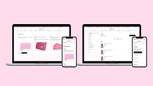
Leesy design system
.png)
Project Overview
The objective of this project was to develop a robust and scalable design system to enhance designer efficiency and maintain consistency across the Leesy platform. The system was built to streamline both the design and development processes, allowing for faster iterations and a more cohesive user experience. Each design component was carefully crafted in Figma and transformed into a comprehensive library for developers to easily access and implement, significantly boosting development speed and consistency.
Key Components
Colours: Primitive colours and tokens, organized using variables for easy management and updates.
Typography: A consistent type scale with a defined hierarchy for headings, body text, and captions.
Iconography: A cohesive set of icons that adhere to the brand’s visual language.
Spacing: Predefined spacing tokens to ensure consistent layouts across the platform.
UI Components
Interactive Elements: Buttons, checkboxes, radio buttons, switches, and tooltips.
Forms: Input fields, dropdowns, date and number pickers.
Alerts & Feedback: Alerts, badges, banners, and notifications.
Cards & Chips: Modular card designs and chips for tagging and filtering content.
Navigation: Scalable header navigation and footer elements to support responsive layouts.
Outcome
The Design System has improved front-end development efficiency by over 30%. It includes more than 356 reusable design elements created in Figma. These elements were made in close collaboration with a front-end developer, who developed each component and colour for smooth integration.
Colour primitive & Token
The purpose of primitive colours in a design system is to provide a foundational palette of basic hues from which all other colours are derived.

.png)
Hex Codes represent the raw colour values, forming the system's base.
Primitives are core colour variables derived from these hex codes, used in foundational design elements such as backgrounds, text, and buttons.
Tokens further extend the application of colours by assigning them to specific functional roles within the interface. In this design system, tokens represent various elevations, surfaces, and borders, ensuring consistent colour usage across different UI layers. By defining tokens for these elements, the system allows for subtle shifts in tone that visually communicate depth, hierarchy, and interaction states.
Maping primitive colours
Primitives: The hex codes are mapped primitives, which act as reusable core colours for high-level elements such as backgrounds, buttons, and text. These primitives provide a foundational palette that can be consistently applied across the entire design.


Maping colour tokens
Building on primitives, tokens are defined to represent specific use cases such as elevations, surfaces, and borders. In Figma, tokens are mapped to variables, allowing for easy adaptation across different UI states and creating a seamless connection between design and development. The use of tokens enables dynamic colour changes for specific contexts, like differentiating active states or highlighting interactive elements while maintaining visual consistency.


Iconography
A cohesive set of icons that adhere to the brand’s visual language.
.png)
Buttons Primary, secondary, tertiary
.png)

Button language
The creation of a design language that allows other designers to use various components whilst creating visual consistency .
.png)
UI Components
Here are a few examples of the 356 reusable design elements that contribute to a cohesive user experience. Each component has documentation on its usage, as seen above with the buttons.
.png)
Libaray orgnisation
The Leesy Design System library is designed to promote ease of use, efficiency, and scalability for both designers and developers. Components are organized into logical sections, such as foundations (colours, typography, icons) and components (buttons, forms, navigation, feedback elements), which facilitates quick access and seamless integration into projects. Each component is built with scalability in mind, allowing for future expansion without disrupting the existing system.


.png)


.png)
.png)


.png)