

.jpg)
.jpg)
NO.7 WATER JUG
THE NO.7 WATER JUG IS DESIGNED AROUND THE IDEALS OF MINIMALISM. BY CREATING A ROUNDED BOTTOM OF THE JUG IT ALLOWS FOR AN UNCLUTTERED DINING TABLE, FORCING THE USER TO PLACE IT BACK INTO ITS HOUSING.
NO.7 WATER JUG
THE NO.7 WATER JUG IS DESIGNED AROUND THE IDEALS OF MINIMALISM. BY CREATING A ROUNDED BOTTOM OF THE JUG IT ALLOWS FOR AN UNCLUTTERED DINING TABLE, FORCING THE USER TO PLACE IT BACK INTO ITS HOUSING.
Build Your Own Bundle

Original, MVP, Final design
-
The original design requires the user to select one colour from the dropdown menu. With the launch of new colours as a focus for 2021, the dropdown list will continue to lengthen and require further scrolling.
-
By expanding the colours in the MVP, we are introducing gamification and fostering creativity whilst increasing the usability of the experience.
Original
.png)
MVP
.png)
Final design
.png)
Testing
Goals
-
The goal of this testing is to assess the usability of the BYOB experience on Mobile. We want to gather some initial insights to create assumptions, and then continue to validate these assumptions in follow up tests. At the end of testing, we will have gathered insights to make any necessary design and functionality improvements.
Method
-
The method for this usability testing is blind user sessions via userbrain.com & user interviews.

Insights
Top secret, sorry.
Market leading MVP
After the launch of the Bed Threads Build Your Own Bundle MVP, direct competitors used it as 'inspiration' for their experience. They did execute some features better than our MVP! Which allowed us to conduct blind usability testing, allowing us to enhance our experience


MVP review
After the launch of the MVP, I conducted a detailed review of the design to uncover areas of opportunity. I noticed that there was inconstancy with the mobile and desktop progress bar as well as other usability problems which were uncovered through Hot Jar, and usability testing.
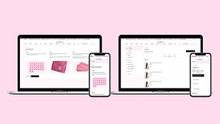
Progress bar
As you can see by the below images of the progress bar, there are some inconsistencies across the mobile and desktop experience. Specifically, the sheets and the pillowcases this was one of the focuses of the re-design.
Mobile
Desktop
Progress bar ideations
As you can see by the below Ideations, designing a progress bar that moved linearly on desktop would not allow me to solve the above problem. Some ideations of the progress bar, the font was too small for a sub-heading, and some of the steps were too close together.


Problem solving
I needed to use my lateral thinking and creativity to solve this problem. I found a lot of inspiration in how Gmail, Wix, Minecraft and the settings for my monitor are laid out. You notice with the images below that they stack their options and move left to right... why does the progress bar need to move linearly?... it doesn't, It can progress vertically, and I can stack the options.


Desktop progress bar ideations
You can see with the below ideations that I was exploring where to place the signifier and the overall UI

Progress bar desktop

Ideations features mobile

Select size ideations
.png)
Flow ideations

Ideation and refinement of concept across mobile and desktop

Developer notes


File orgnisation

Final design
Progress disclosure
Through testing, we noticed some users were getting "excited" about the colour options and missing steps. I utilised progressive disclosure to break down the larger steps into manageable tasks.

Mobile

Signifier allowing the user to visualise the completion or incompletion of steps.
3d render allows the user to visualise their combination
Primary CTA
Start over and save for later feauture
Colour swatches
.png)
In the summary step, the 3d render becomes smaller, allowing the user to review their items whilst still being able to visualise the bundle
Signifier highlighting completion or inculpation of a step
Ability to edit the child items
Summary
Desktop

The right-hand 'workspace' allows the user to have a more efficient workflow.

The inspiration pop-up allows the user to ensure their bundle will match their aesthetic by comparing the render and inspiration side by side, thus reducing the number of amended orders, and saving the business money.


.png)


.png)
.png)


.png)